Do the Calgary Flames have the best jerseys in the league?

By Mike Gould
3 years agoThe Calgary Flames have made big strides in many respects this off-season.
They added Jacob Markstrom and Chris Tanev on long term contracts in a bid to solidify their overall defensive game. Geoff Ward received a new two year deal to be the team’s 20th head coach after overseeing a 25-15-3 run as the team’s interim coach for the latter part of the 2019-20 season.
However, the Flames’ biggest changes perhaps came with regard to their on-ice apparel. The team reinstated the classic “retro” look it had primarily worn previously between 1980 and 1994, ditching its existing black-trimmed white road jersey while relegating the black “C” jersey to alternate status.
Subsequently, with the release of the league-wide “Reverse Retro” jersey line, the Flames added a fourth jersey to the rotation. The new “Blasty” or “horsehead” jersey draws heavily from the Flames’ earlier black uniform, worn between 1998 and 2006, substituting out the red “C” shoulder patches for white ones while eliminating the red area around the waist. The result: a sleek, if slightly uneven, black jersey that looks great when paired with the Flames’ old pedestal-era pants.
Are these changes enough to propel the Flames into the top spot in our NHL fashion power rankings? Let’s take a look at the five best-dressed teams in the league.
But first—some honourable mentions:
- The Buffalo Sabres vastly improved their uniforms this off-season, finally kicking the dull navy and the tacky front numbers to the curb in favour of a gorgeous royal blue look heavily inspired by the team’s Gilbert Perreault-era jerseys. After years of watching the Sabres make so many wrong decisions about their uniforms, that change was very nice to see. Their Reverse Retro jersey isn’t bad, but it might have been better if they’d instead decided to re-imagine the “buffalo head” jersey from that era.
- Lou Lamoriello undoubtedly had a say in the New York Islanders‘ Reverse Retro uniform. It basically looks exactly like their existing home uniform, except with navy blue as the base colour and the orange and white waist and arm striping flipped. That said, despite being relatively uninspired, the Isles’ Reverse Retro jersey is still absolutely gorgeous, with the orange highlights popping beautifully against the deep blue. Their other three uniforms also receive high marks—even the third jersey, which looks surprisingly good on the ice despite the somewhat odd-looking crest.
- Only the Vegas Golden Knights could pull off a glittery gold jersey. While the team’s inaugural grey and white jerseys sold extremely well and will be remembered fondly for their part in the Knights’ 2018 finals run, it wouldn’t be surprising to see the new gold look receive primary deployment at some point down the line during the Alex Pietrangelo era. Meanwhile, as part of the Reverse Retro series, Vegas debuted a new red jersey based on the old International Hockey League’s Las Vegas Thunder. As a novelty uniform, it’s really cool, although the crest doesn’t really belong on the front of an NHL jersey.
- The Edmonton Oilers… just kidding.
Let’s move on to our top five.
5. St. Louis Blues
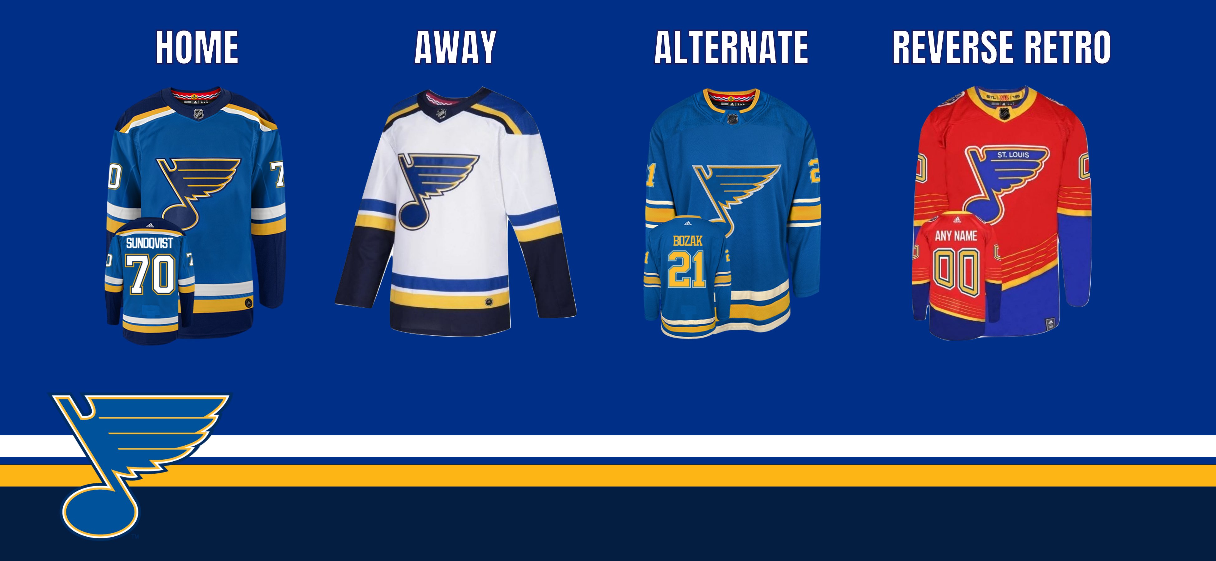
The St. Louis Blues’ four jerseys. Images from CoolHockey and Adidas.
The St. Louis Blues have long had excellent uniforms, with the notable exception of their initial Reebok Edge home and away jerseys. With some ugly piping and weird shoulder and arm striping, those jerseys stick out like a sore thumb when surveying St. Louis’ page on the NHL Uniform Database.
Thankfully, the Blues cleaned up their home and away uniforms in 2014, transitioning to a design inspired by jerseys they had worn on a primary basis between 1998 and 2007. The Blues’ current primary jerseys allow all four of their team colours (royal blue, navy blue, gold, and white) an opportunity to shine as part of a simple, cohesive design with sleek striping.
Back in 2016, the Blues introduced a special uniform to be worn in the 2017 Heritage Classic against the Chicago Blackhawks. The light blue jersey with gorgeous yellow accents drew inspiration from St. Louis’ original 1960s-era design and became so popular that it became the team’s full-time alternate jersey in 2018-19.
In 2019-20, St. Louis introduced a fourth jersey that reintroduced red into their colour scheme. Featuring bold diagonal striping and irregularly-shaped numbers, the uniform served as a nod to the Blues’ Wayne Gretzky days. That uniform lasted just the one season, but the team opted to use a similar design for the Reverse Retro line, swapping the main colours on the original to create a red design for a team called the Blues. Unorthodox, to be sure, but it looks sharp.
4. Ottawa Senators
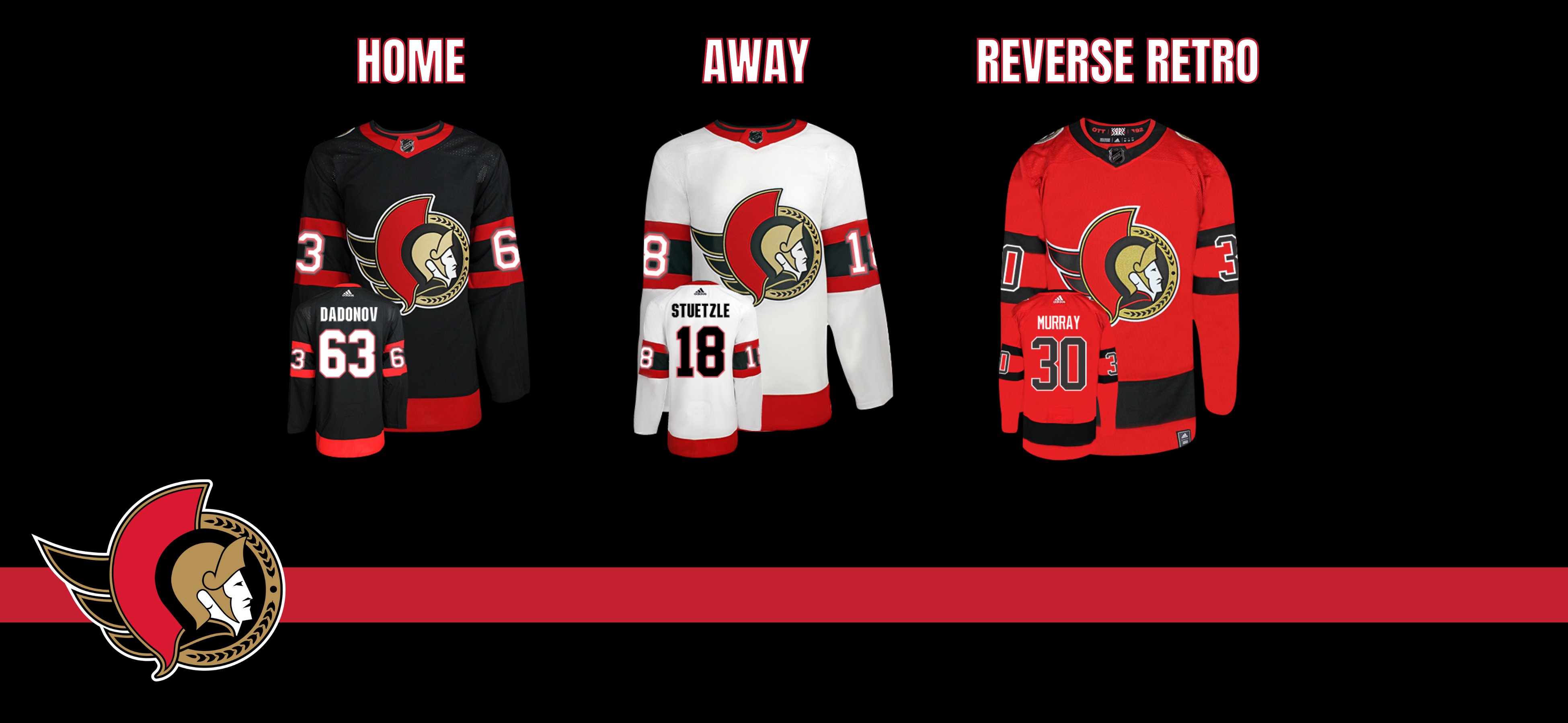
The Ottawa Senators’ three jerseys. Images from CoolHockey.
It’s likely that the Ottawa Senators won’t win a ton of games in 2020-21, but at least they’ll look good while they’re out there. The Sens issued a full-scale re-brand earlier this fall, replacing their previous three-dimensional centurion primary logo with a two-dimensional variant similar to those originally worn between 1992 and 2007.
Also returning to Ottawa? Black jerseys. The Senators’ new home uniform looks pretty similar to a design worn by the team from 1992 to 1995. It’s absolutely beautiful. The understated red striping and dignified logo combine to help create one of the classiest jerseys in the league. Its white counterpart hits many of the same notes, but something about the black base of the home jersey combined with the simple red accents elevates it to a status best represented by the word “elegant.” It might be the single best jersey in the league.
The Sens are one of a select few NHL teams running with just three jerseys next season. Their Reverse Retro uniform is basically just an inverse of their new home jersey. This is the first time the 2D logo has ever been depicted as the main crest on a red jersey and, surprise, it looks great. In short, the Senators have a lovely set of uniforms for this coming season, and they all conform to a nice, consistent template.
3. Arizona Coyotes
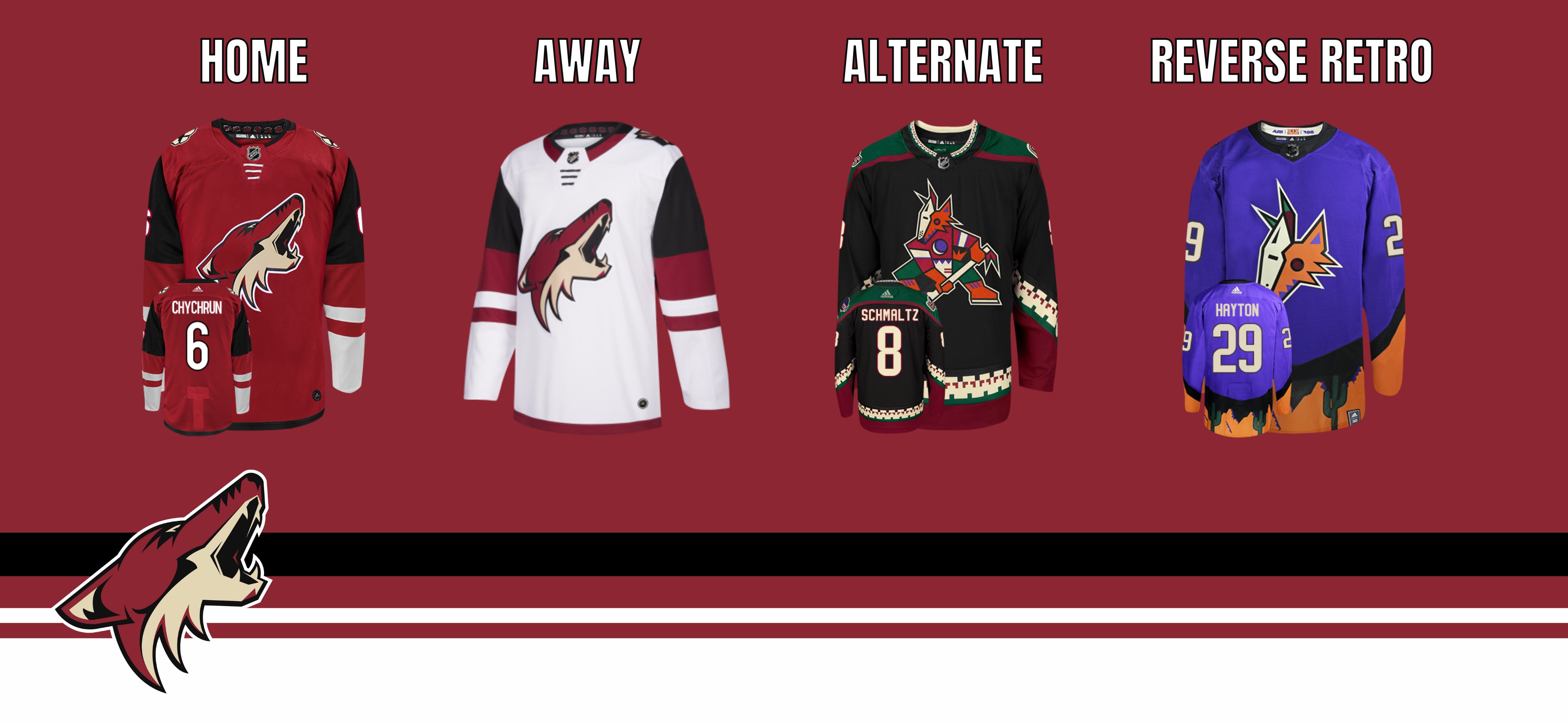
The Arizona Coyotes’ four jerseys. Images from CoolHockey and Adidas.
The Arizona Coyotes boast one of the league’s most unique and interesting colour schemes. Sure, they’re technically another “red” team in a league full of them, but let’s be real—that home jersey is maroon, or even brown, way before it comes close to being red. Officially, the ‘Yotes brand it as “brick red.” Either way, it looks great alongside the beige in the logo and with the black and white stripes on the jersey. The crest gets even more of a chance to shine against the white base of the away jersey and it pops very nicely.
Arizona loses no points for their primary jerseys: they have nice colours and no real flaws. But where the Coyotes really shine is with their alternates. The black Kachina alternate is a thing of beauty and will probably become the team’s full-time home jersey at some point. The logo is an absolutely fantastic mix of vibrant colours and stylized features. It mixes orange, brick red, green, beige, purple (!!!!), and black while somehow not turning into a mess. The waist and arm striping is the most inventive in the NHL or really any other major North American sports league. It’s art.
And then… the Reverse Retro jersey. Wow. How many other NHL jerseys can claim to rock the colour purple with such confidence? This bold new purple design is based on the Coyotes’ first-ever alternate jersey, worn between 1998 and 2003, and it might be the best of Adidas’ latest line of retro jerseys. Not enough sports teams wear purple.
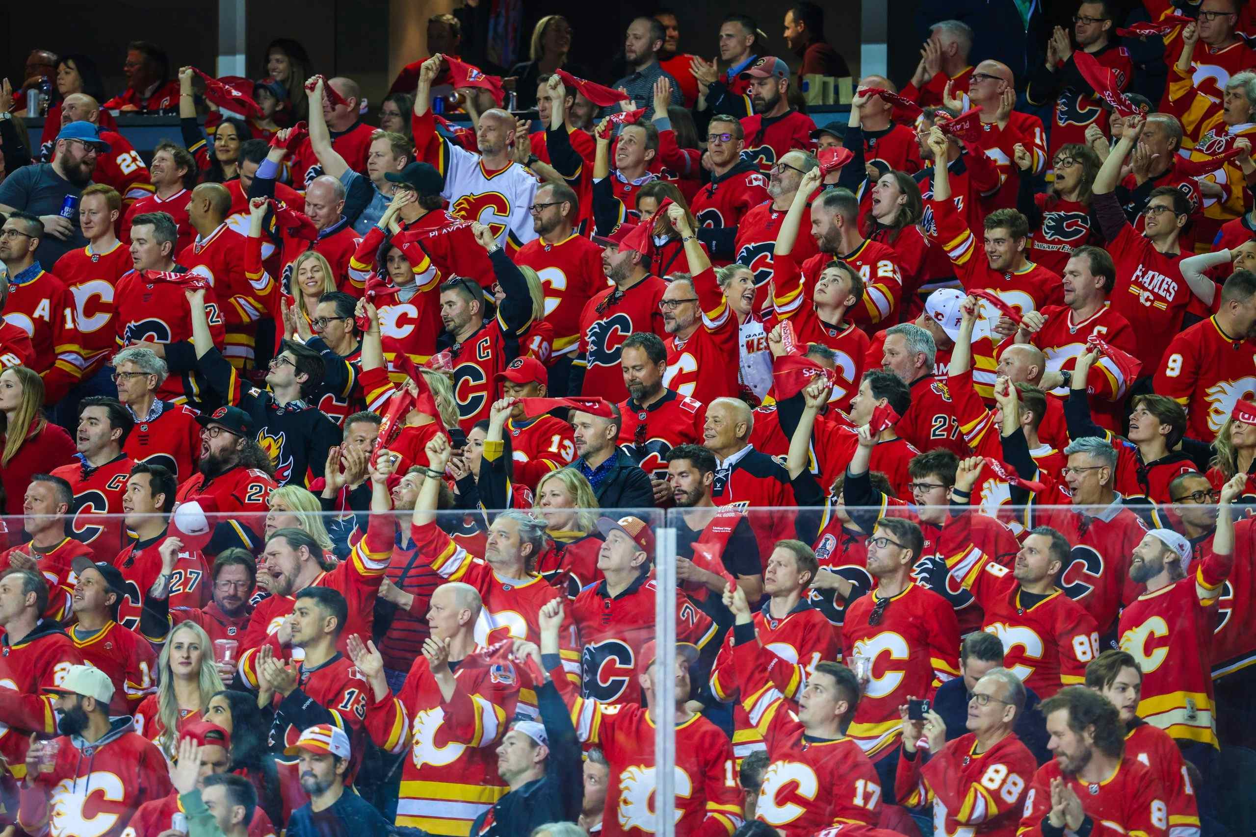
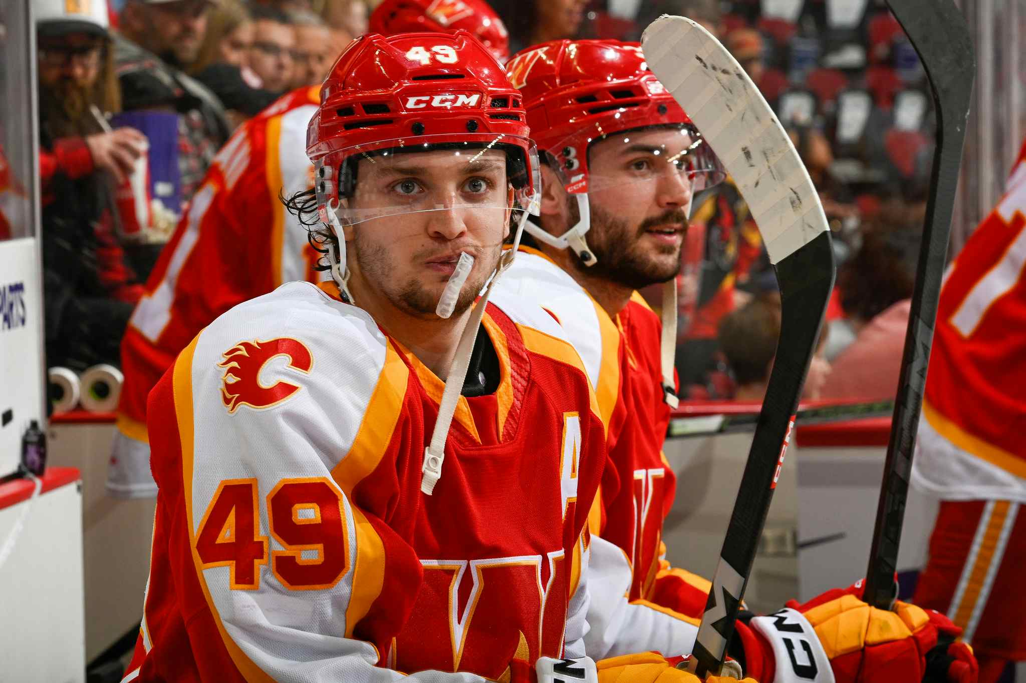
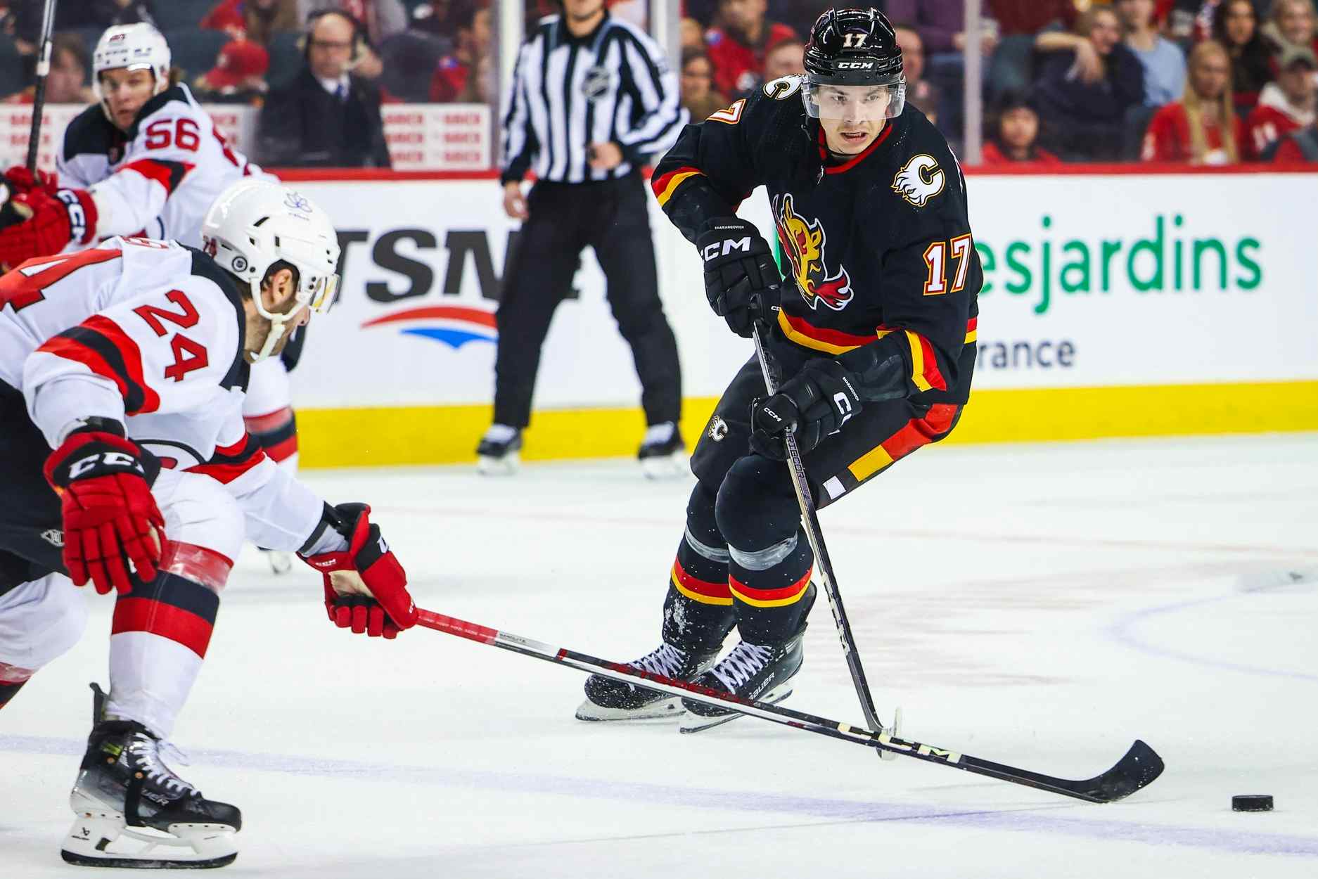
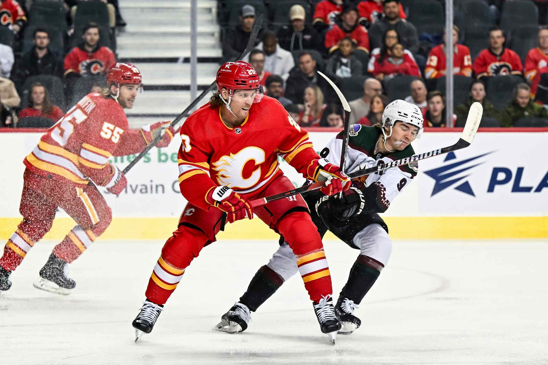
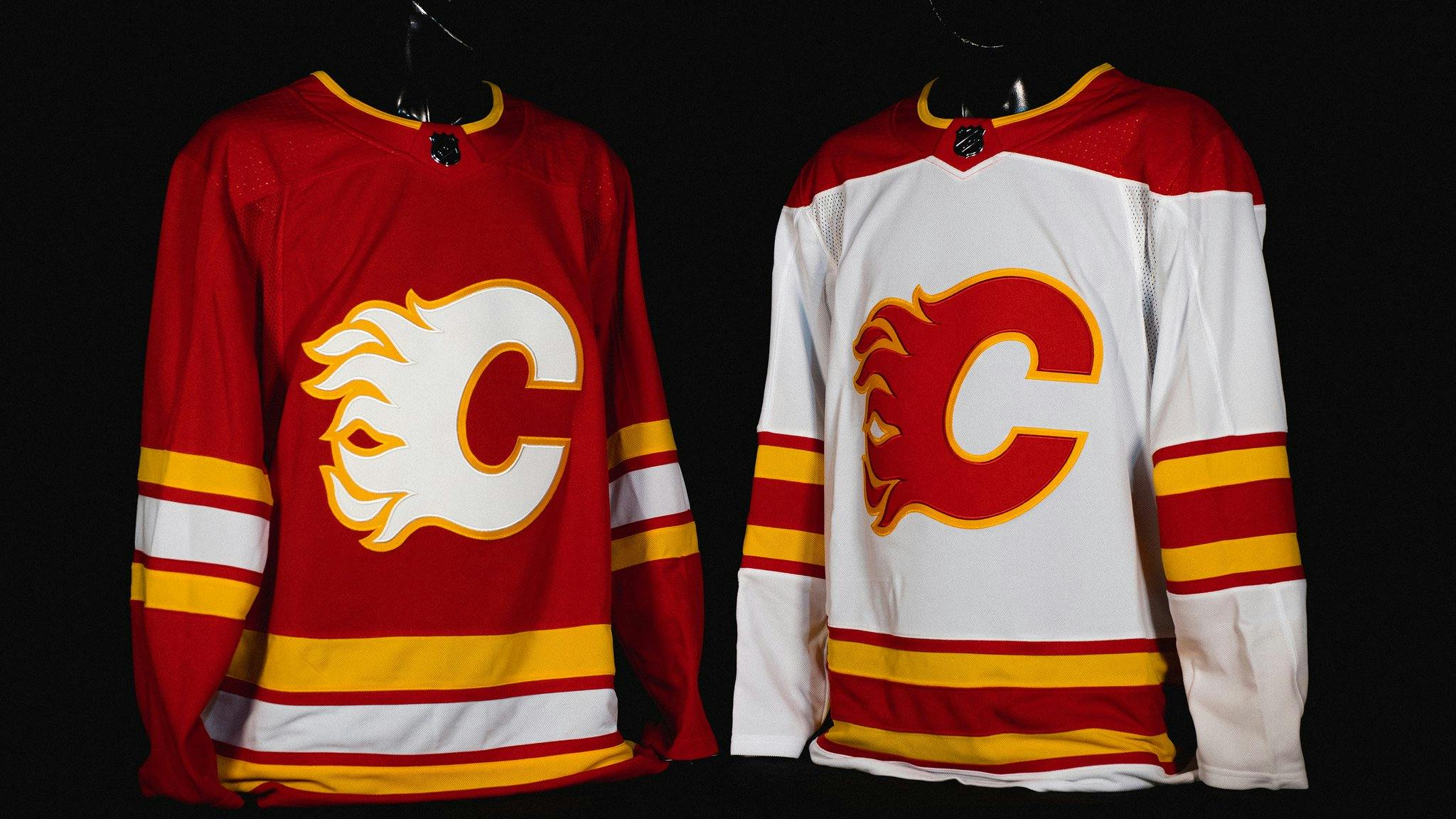
2. Calgary Flames
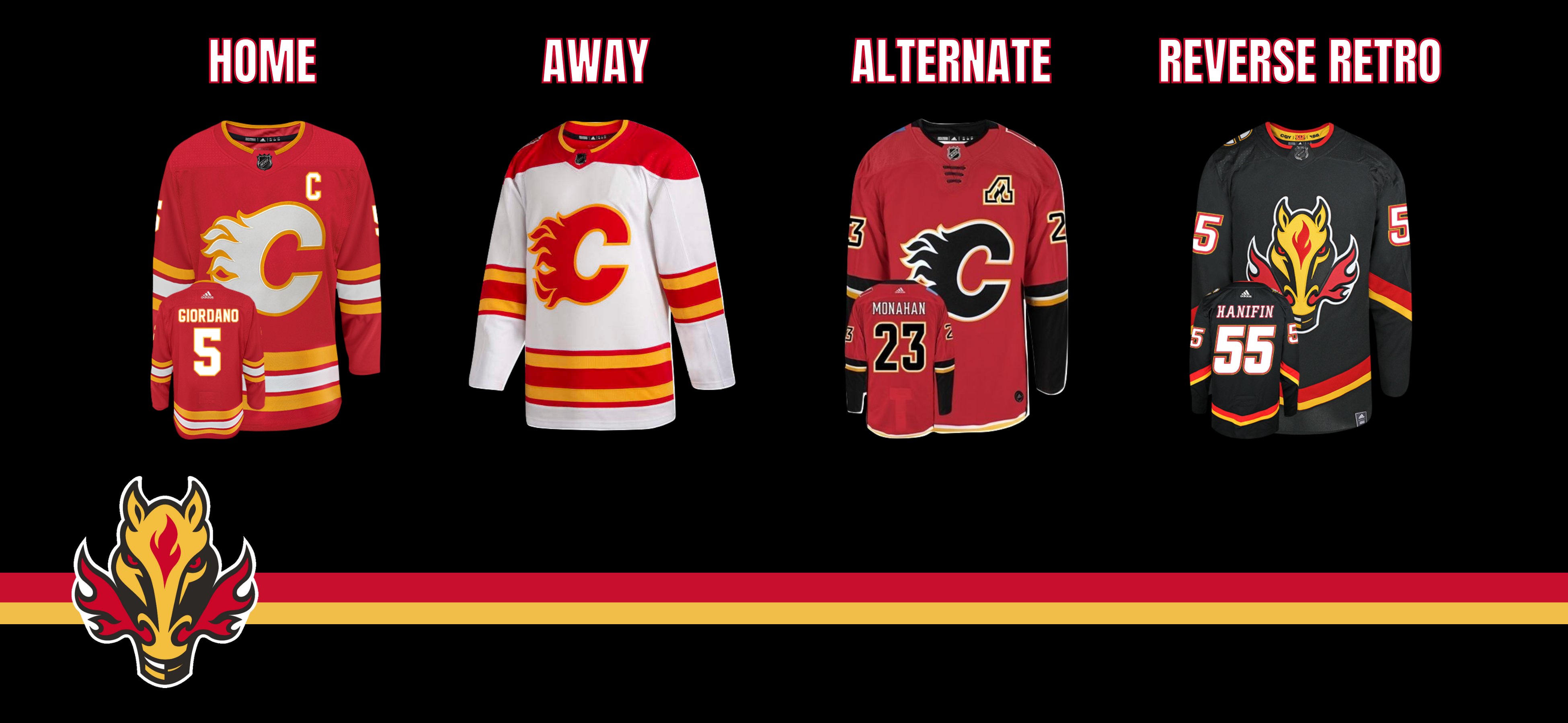
The Calgary Flames’ four jerseys. Images from CoolHockey and Adidas.
No, the Flames don’t quite have the best jerseys in the league… but they come extremely close. They’re certainly much, much higher on this list than they would have been six months ago.
The Flames mercifully moved on from the flag-adorned jerseys in October in favour of going to “full retro,” with a small caveat—the old black “C” home jersey will be sticking around, in a significantly reduced role, as the team’s alternate jersey. (It wouldn’t be surprising to see the Flames come out with a new alternate jersey very soon). Old is new once again in Calgary, with the team returning to the original design worn by the likes of Lanny McDonald and Håkan Loob between 1980 and 1994. It’s a classic look that should never be touched ever again.
The new Reverse Retro jersey brings back another look from the Flames’ past. “Blasty,” or the “horsehead,” played a big role in the Flames’ branding between 1998 and 2007 and has emerged as a cult figure among a certain sect of Flames faithful in recent years. Sure, the new uniform looks fantastic in tandem with its corresponding pants and socks, but it also looks great on its own. It’s clean, bold, and fun.
Look, the Flames’ jersey set isn’t perfect. In particular, the alternate has a lot of room to improve: the side striping and flag patches could probably stand to be addressed and removed on a future design. But few designs in the league approach the Flames’ retros in terms of timeless appeal while even fewer can claim to be as fun as the Blasty jersey.
1. Montreal Canadiens
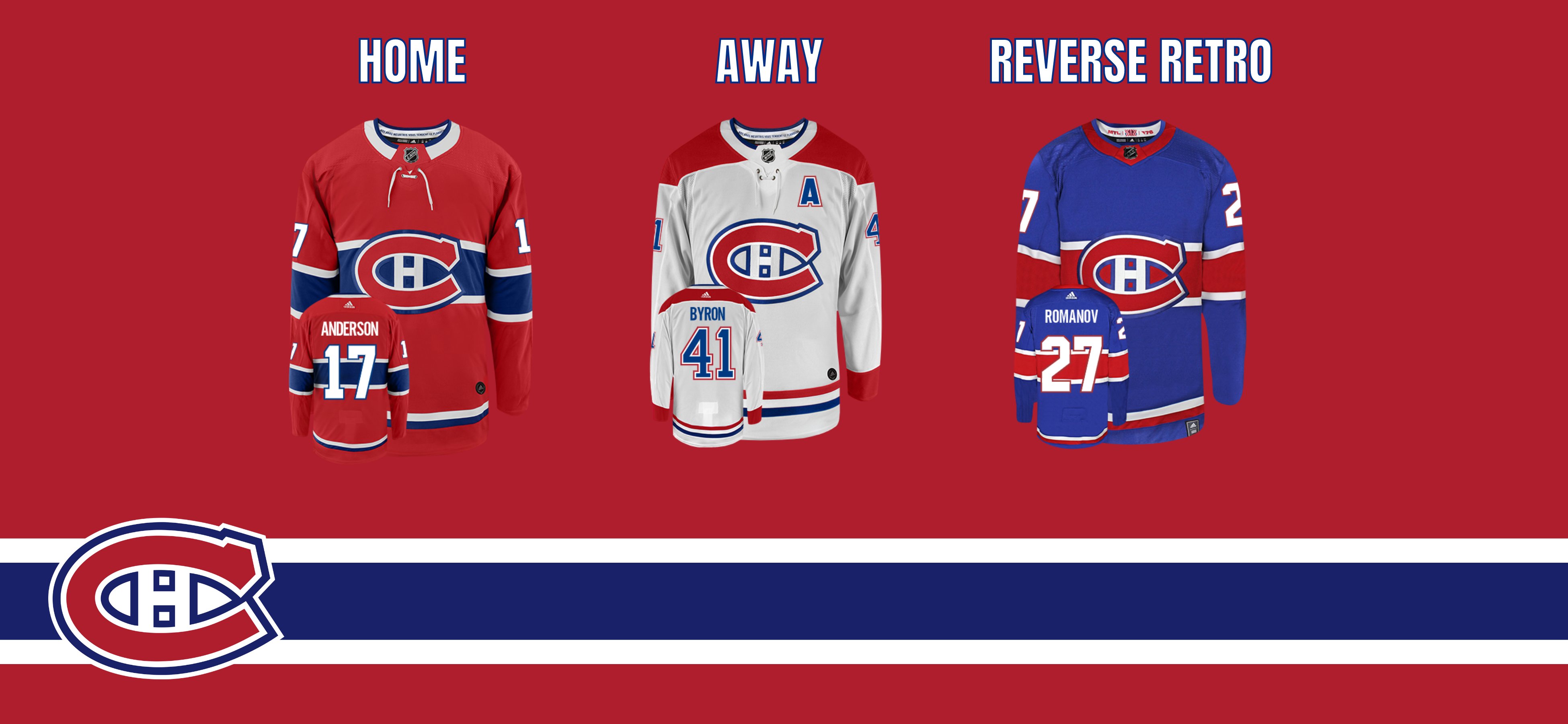
The Montreal Canadiens’ three jerseys. Images from CoolHockey.
Let’s list all the problems with the Canadiens’ jerseys:
- The laces on the primary jerseys and the collar on the home uniform make things a tiny bit cluttered.
- It’s a little bit weird that the white jersey doesn’t have a chest stripe of its own.
- …
Yeah, that’s about it. The Habs’ logo is timeless, simple, and instantly recognizable. The three colours are all great and it’s great that they each get the chance to shine as the base colour of a jersey. The new blue uniform is amazing (it even fixes the collar and lace issues of the other jerseys!) and it would be great to see it stick around past this year.
Montreal doesn’t mess around with their jerseys. Most of the Original Six teams have classic looks, but Montreal goes a step beyond that. Even Toronto changes things around a fair amount—they just came out with a “new” logo in 2016—but Montreal almost never changes even the tiny details on their jerseys. They’re truly iconic… just ask the kid from the book every Canadian child is legally obligated to read at some point. Roch Carrier knew better than anyone that the Habs’ jersey is the “Hockey Sweater.”
That’s why it was so surprising to see Montreal go with something eye-popping for the Reverse Retro line. It seemed more likely that they’d bring back something like this slightly altered alternate they wore in 2006-07. Seeing a blue Habs jersey is a very pleasant surprise and it only strengthens their rating.
Check out this Twitter thread from Mike for a full top-32 ranking list, featuring individual graphics for every single team (including the Seattle Kraken!).
What do you think of this top-five? Are the Flames too high or too low? Post your take in the comments!
Recent articles from Mike Gould