
Nation Sites
The Nation Network
FlamesNation has no direct affiliation to the Calgary Flames, Calgary Sports and Entertainment, NHL, or NHLPA
Ranking the three best and worst jerseys in Calgary Flames history
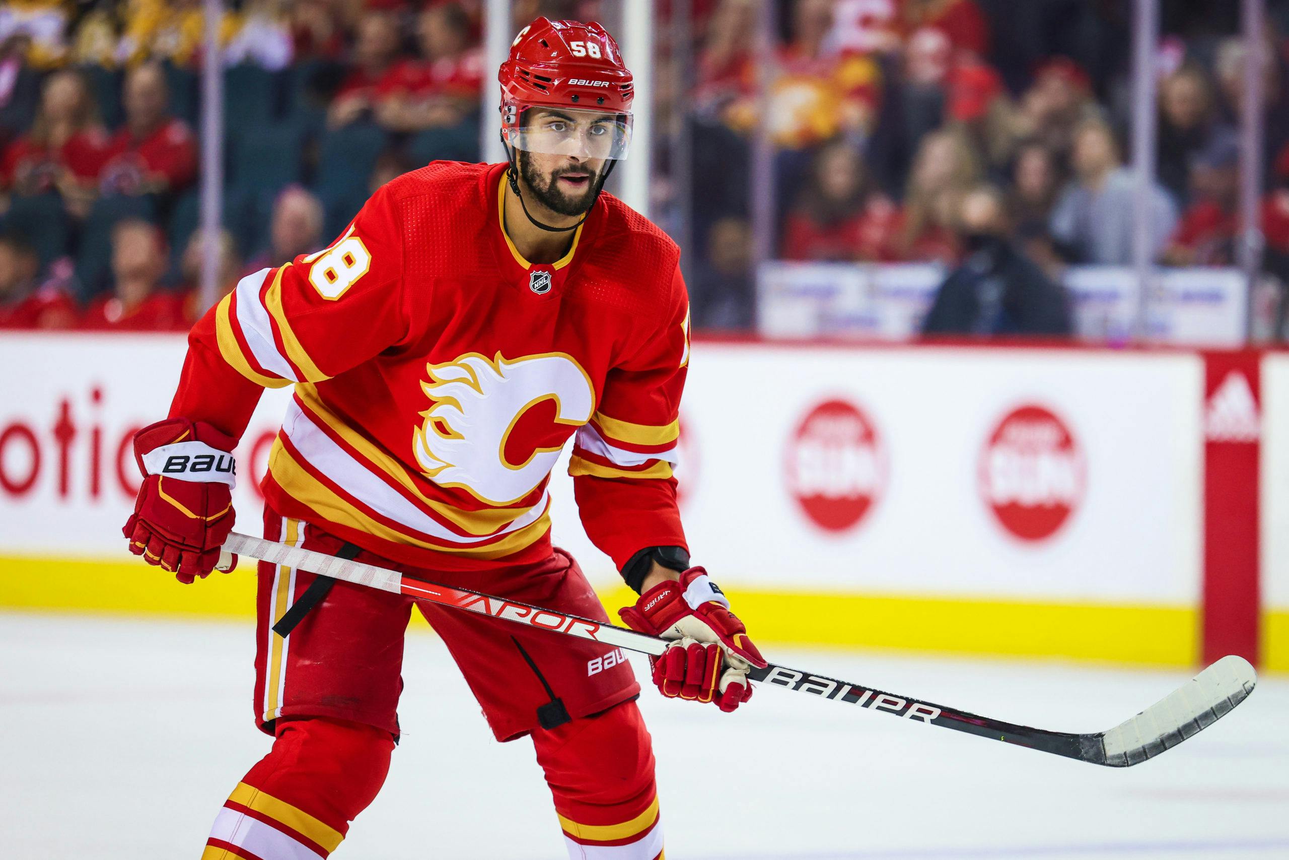
Photo credit: Sergei Belski-USA TODAY Sports

By Mike Gould
Jan 1, 2022, 14:30 ESTUpdated: Jan 1, 2022, 14:20 EST
Welcome to 2022, Flames fans!
While 18 teams will be in action on this New Years’ Day, the Calgary Flames will sit on the sidelines and wait to take on the Chicago Blackhawks on Sunday. In the meantime, we here at FlamesNation decided the time was ripe for an article on the lighter side.
Last week, we learned that the Flames are getting a new third jersey for the 2022–23 season. The new uniform is likely to reincorporate black, a shade the Flames ditched this season in favour of their classic tricolour look.
The team’s previous flag-adorned alternate jersey made use of a black flaming “C” as its crest, something that no longer appears on either of the Flames’ active uniforms. Calgary has just two active jerseys for 2021–22 — one red, one white, both colloquially known as the “retros.”
Now, the Flames appear primed to embrace black on an alternate jersey once more. In the spirit of this news, let’s take a look at the three best and worst uniforms the Flames have worn since they relocated to Calgary in 1980.
The Bottom Three
3. 2011 Heritage Classic

Photo via NHL.com
At least they tried to do something different, but there’s still no getting past how much this uniform resembles cascading layers of ketchup and mustard. Cream is a difficult colour to make work on a hockey uniform but it works better here than on most throwback designs, although the pants are a little much. The felt logo was a nice touch.
These uniforms worked just fine for a special event, but they would’ve quickly become eyesores with repeated use. The jerseys also opened the door to a tidal wave of shoddy knockoffs that still pop up in the Saddledome to this day.
2. The Script Alternate
Photo via Sportsnet
This uniform screams “designed by committee.” Why was the “5” the Flames used on the jersey just an upside-down “2”? Why was the flaming “C” even on there? Did @Mark Giordano’s jersey really need to have three “C”s down the front?
These earn extra points because @Johnny Gaudreau wore them a lot as a rookie (and that season was a ton of fun). That said, for reasons unknown, these uniforms replaced the classic retro red jerseys as the Flames’ alternate look. Even the team seemed to realize that this was a mistake, reinstating the old design with the white “C” as the alternate for the 2016–17 campaign.
1. Piping and Flags

Photo via NHL.com
Immediately after the Flames introduced their new Reebok Edge jerseys in 2007, many fans recoiled at the notion that a blue shoulder patch would be featured on the team’s red jerseys. The Flames continued to wear those same aesthetically disruptive flags on their shoulders for the next 14 years.
These uniforms featured pronounced vertical striping under both arms and piping that continued all the way up to the side numbers. The resulting look vaguely resembled that of a grilling apron in an Incredibles colour scheme.
When Adidas took over the NHL’s jersey manufacturing contract in 2017, the Flames’ redesigned uniforms ditched the piping but kept the flags and the vertical stripes. Even when the Flames went “full retro” for 2020–21, the flag jersey remained as an alternate. It took until 2021–22 for the Flames to finally retire these ultra-busy Reebok Edge holdovers for good.
The Top Three
3. The Pedestals

Photo via Getty Images
Yeah, they’re a little silly. Maybe they look a little like something Team Germany might wear at the Olympics. But the Flames’ 1990s-era “Pedestal” uniforms hold up surprisingly well in 2022 and remain one of the most unique looks in NHL history.
These jerseys were unveiled at a time when NHL teams and jersey manufacturers were just discovering the “sublimation” fabric dyeing technique, which paved the way for more creative uniform designs. Those diagonal lines were not individually stitched onto each jersey, no — that striping was injected directly into the fabric using various dyes. The same process also enabled teams to add gradients and very ornate patterns to their jerseys.
The Pedestal jerseys introduced black into the Flames’ colour scheme. It’s used very sparingly on the actual jerseys and helps make the waist striping and collar look complete. The white shoulders — red, on the white uniform — look surprisingly clean and help up the overall contrast on the uniform. The Flames brought back those pants in 2020–21 to accompany their “Reverse Retro” uniform, and for good reason — they look awesome.
2. The Retros
Photo: Steven Bisig-USA TODAY Sports
The single best word to describe the Flames’ retro jerseys is “clean.” The team’s three colours — red, white, and yellow — all mesh well in this design, with no extraneous details or frills. It’s actually stunning how closely the waist striping on the red retro jersey resembles that found on a typical New York City fire engine.
These should always be the Flames’ primary uniforms. There’s plenty of room to experiment with third jerseys. The retros are an iconic main look from which the Flames should never deviate (again).
Calgary won the Stanley Cup in the retros. Enough said.
1. The ’04s
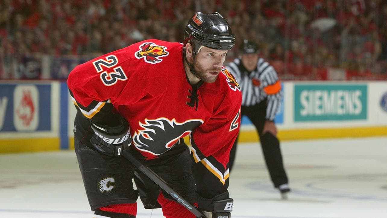
Photo via FlamesNation.
It’s funny how a few small changes can completely save a uniform.
In theory, this look isn’t so different from the one listed above as the worst in Flames history. Except … there are no mismatched shoulder patches. All the vertical lines are gone in favour of dynamic chevron striping. Even the pants are cleaner.
It’s a crying shame that the Flames only wore their 2004-era red uniforms for three seasons. (The white version debuted three years earlier). These jerseys retain all of the positive elements from their Reebok Edge cousins — the improved contrast of the black “C”, the unique lettering font, the black forearms — but with so many subtle improvements.
The retros are perfect primary uniforms. They’re classics for a reason. But … they’re also very bright. The Flames’ 2004-era design features the exact same shade of red offset against exactly the right amount of black. The Blasty logo on the shoulder completes the look and helps ensure the colour yellow is properly represented on the uniform.
In my eyes, the perfect Flames jersey set would keep the retros as the main uniforms with the red 2004 jersey as the alternate. I think the 2004 design surpasses the retro look, but only barely. They’re both fantastic.
Which do you prefer: Calgary’s 2004 jerseys, or their retro uniforms? What do you think is the worst uniform design in Flames history? Let us know in the comments section!
Breaking News
- Scotia Place: a street-level look at December construction progress
- Beyond the Boxscore: Flames come out swinging in big 6-3 win over Golden Knights
- Rasmus Andersson on remaining a Flame: ‘It takes two to tango’
- Ryan Lomberg’s big goal and big fight highlight Flames win over Vegas
- Instant Reaction: Flames overwhelm Vegas early, hold on for win