One-on-one: Flames marketing head Ryan Popowich details move to ‘full retro’

By Mike Gould
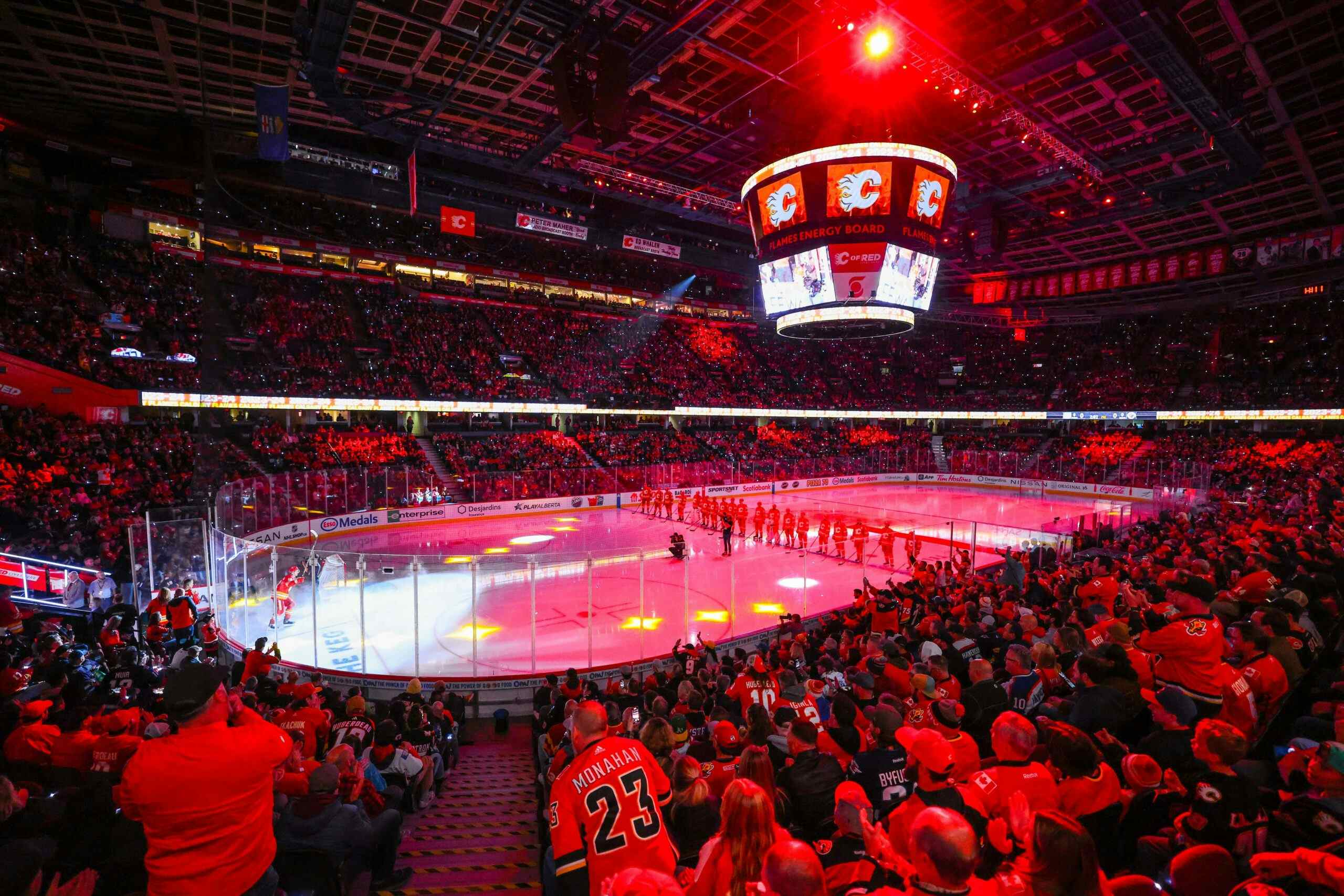
3 years agoAfter 25 years of toying with black as a key component in their home and away sweaters, the Calgary Flames have finally returned to their trailblazing uniform design.
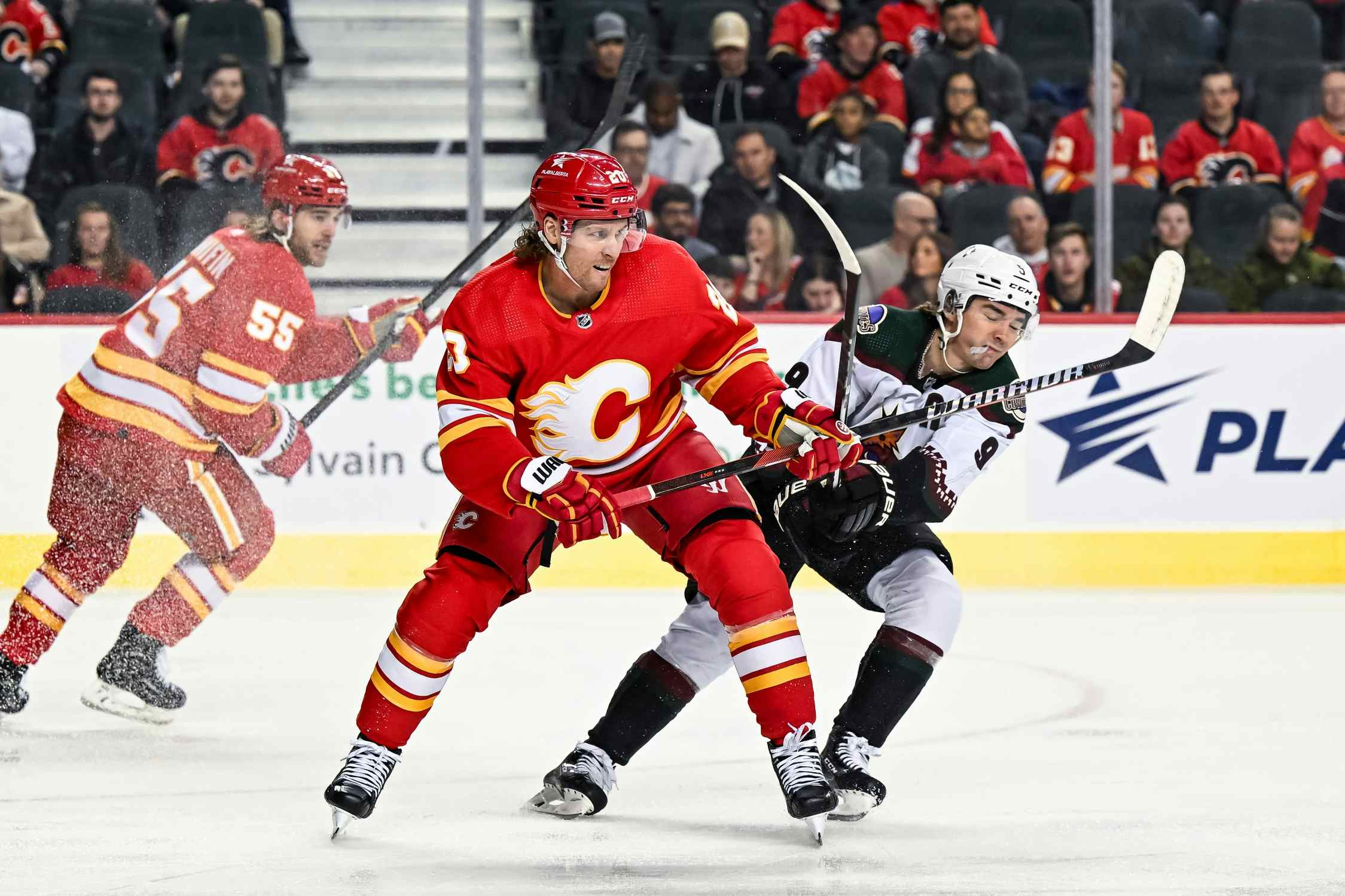
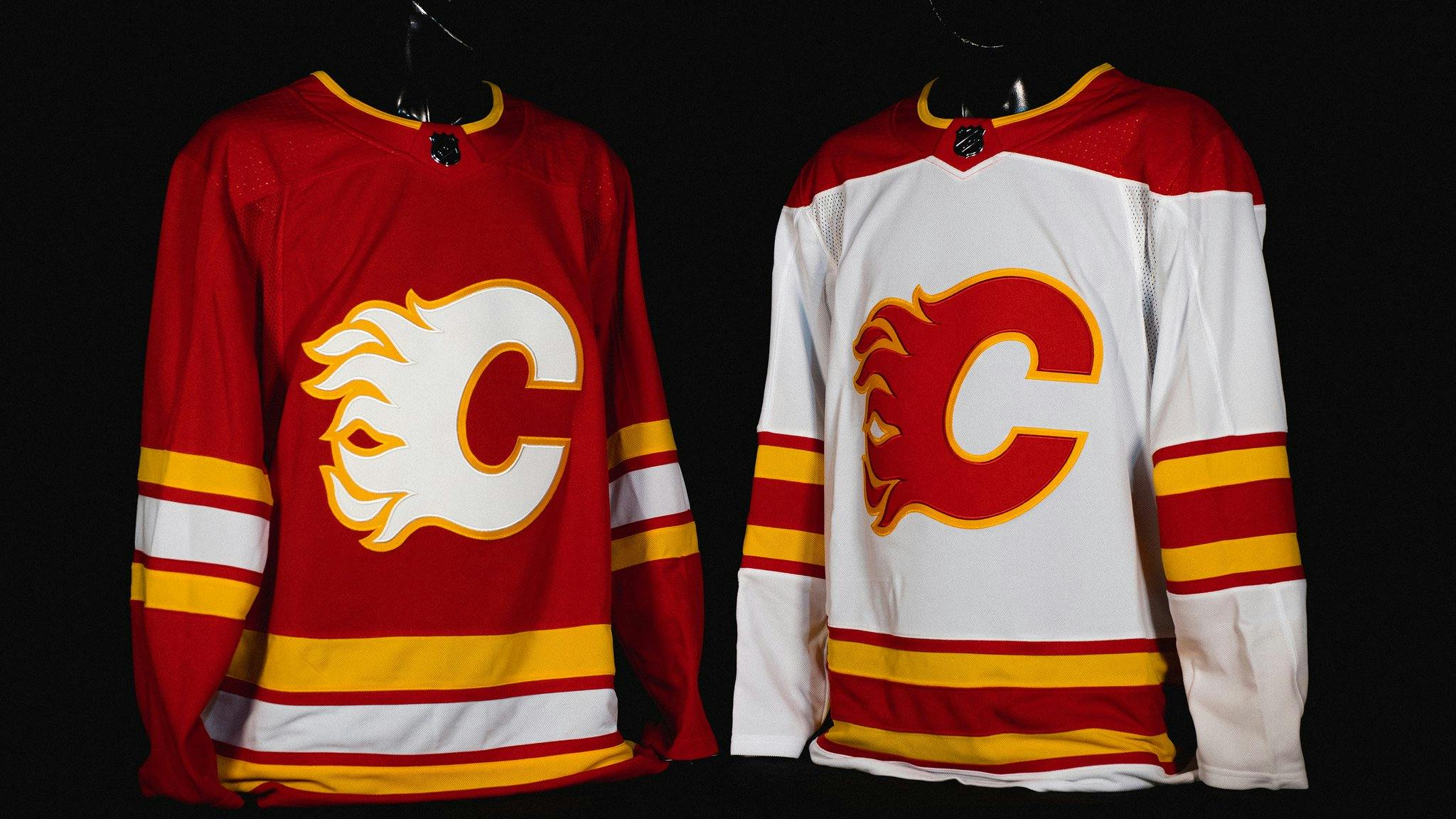
The “full retro” initiative, announced Monday as part of the club’s 40th anniversary celebrations, sees the return of the classic tri-tone colour scheme (red, yellow, and white) for the Flames’ primary jerseys. The team’s previous home jersey, featuring a black “C” crest and the flags of Alberta and Canada on the shoulders, will now be worn infrequently as an alternate.
Of course, these “new” jerseys are really anything but. They were worn initially from 1980 to 1994 before being replaced by the infamous “pedestal” jerseys. After a long hibernation period, the classic red sweater with the white “C” reappeared as an alternate in 2009. The white jersey slumbered even longer before finally resurfacing at the 2019 Heritage Classic against the Winnipeg Jets.
In the wake of Monday’s reveal, I spoke to Flames director of marketing Ryan Popowich for an hour about the “full retro” change and all else Flames jersey-related. (Yes, we talked about Blasty). Let’s dig into some of the big takeaways from that conversation.
Full Retro
Popowich joined the Flames in April 2016 but he said that discussions about returning to “full retro” had been going on for years before he arrived in the team’s marketing department.
“There’s lots of barriers and hoops that you’ve gotta jump through to get anything going, whether it’s a jersey change or a logo change or anything,” said Popowich. “You can’t just decide on your own whatever you want to do, because you’re part of a collective. And at the same time, you’re trying to appease the feedback from the fans.
“In this particular process, for the retros, when I got there in 2016, the fires had already sort of been stoked,” Popowich continued. “As soon as I got there, the discussion was about retros, but it wasn’t as hot as it got in terms of the last two seasons, obviously.”
With the retro red design already in the fold and popular with fans, it was the natural choice to become the alternate jersey when the NHL’s initial third jersey program opened up in 2018, the second year of the league’s partnership with Adidas as the uniform supplier for all NHL teams.
However, Popowich said that introducing the retro red’s white counterpart had to wait for the right moment.

“We knew, upcoming, that there was probably going to be a Heritage Classic,” said Popowich. “We lobbied really hard to be a part of that Heritage Classic, and one of the main reasons was we knew we’d get the opportunity to possibly do another jersey, and that would sort of speed up the timeline [to go full retro]. When that came to fruition, we obviously went right to the retro away. It was a no-brainer.
“Once we had both those pieces, it was easy to do the switch,” he added.
Popowich further revealed that there were a few times along the way where the Flames nearly made some changes to their retro philosophy.
“Four years ago, we talked about going to retro full-time, but the conversation actually was, ‘should we go back to our original jerseys or should we update the look?'” said Popowich. “We just felt more comfortable that, if we went back to our original look, that we would still get an opportunity to do other things down the road.
“I can tell you, right at that crossroads, right at that key moment where we were making that third jersey, we did both. We said, ‘we already know what the retro jersey looks like, just, what does it look like in an AdiZero cut?’ And then, we were like, ‘let’s do something that’s a modern take on the retro jerseys, using the colouring.’ I’ll tell you right now, we went as far down the road as creating a prototype of a modern take on the retro jersey, and, hands down, that was my absolute favourite Flames jersey that I’ve ever seen in my entire life. I wanted that jersey so bad,” Popowich continued.
Ultimately, they opted to play it safe — but also to keep the new concept in mind down the road.
“In the end, once we ran it by senior management, they were like, ‘you know what … let’s just go back to the original striping pattern and all that kind of stuff, we don’t need to rock the boat too much. We’ll have time to maybe do this in the future.’ And, you know what, in hindsight, it was probably the best course of action,” said Popowich. “It’s important to do this as a process.”
The flags: Ken King’s favourite
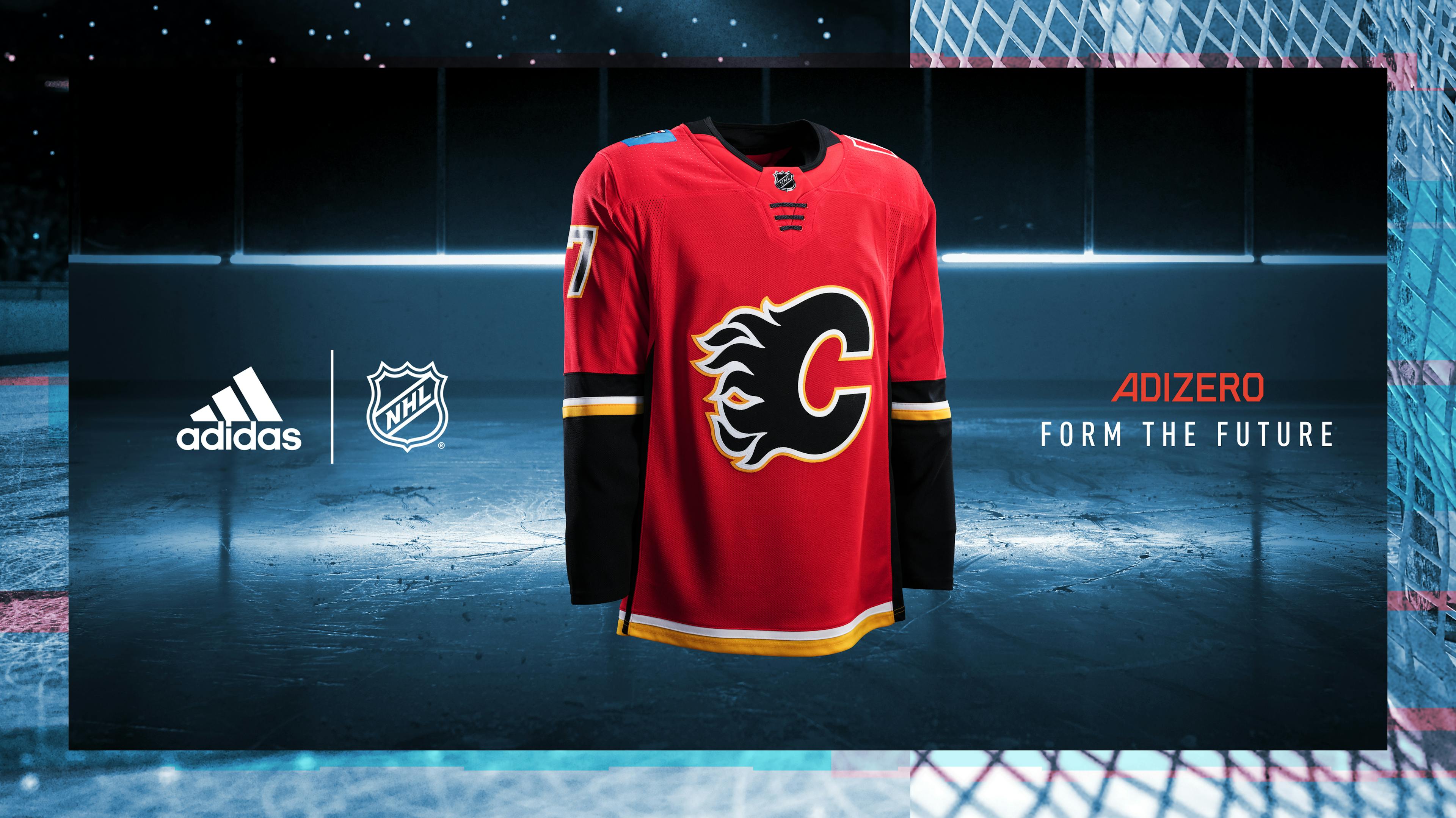
The retro sweaters returning spells the end of a 25-year run of the colour black being featured prominently in the Flames’ primary uniforms.
Of course, with the ousted home jersey remaining in a new capacity as the Flames’ alternate sweater, black isn’t totally gone.
“We could’ve [gone] with no alternate but we wanted to keep the black “C” in play,” said Popowich. “We still have lots of merchandise and some branding around with the red, yellow, white, black colour scheme. And we knew alternates are up for renewal and revision with an eventual Adidas performance upgrade sometime — we know it’s in the future soon. [We] wanted to keep an alternate active so we had the opportunity to update it if the opportunity arose.”
Popowich also stressed that the Flames wanted to keep the previous home around, shoulder flags and all, as a way to pay homage to the man who pushed harder than anyone for them: former Flames CEO Ken King, who passed away from cancer in March.
“[King] had that concept where he wanted the flags, he wanted the team to be representative of not only the city, but the province and the country,” said Popowich. “If you wore that jersey in front of him, he used to punch you in the chest and say “Calgary,” and then he’d punch you in the two shoulders – “Alberta, Canada” – because that’s how it hits home.”
Popowich said the Flames’ design team had thought about alterations to the flags to integrate them more seamlessly into the red, yellow, and black colour scheme. These ideas included isolating the coat of arms in the Alberta flag and, in one concept, even combining the two flags into a hybrid patch design, but they were all shot down due to rigid stipulations by the provincial and federal governments that the flag designs were to remain totally unchanged on the uniform.
Of course, with two teams situated in Alberta, the Flames claiming the blue provincial crest for their own sweater was inevitably motivated in part by the famous rivalry between Calgary and Edmonton.
“Ken obviously wanted the Alberta flag to sort of stick it to Edmonton a little bit, he thought that was funny,” said Popowich. “The other part of the story is, the league actually really pushed back on us putting flags on the jersey, right up to Gary Bettman, himself. He actually phoned Ken and said, ‘that’s not going to happen.’
“The story is, Ken basically put him in his place and said, ‘we’re doing it.’ So, that’s one of the legacies — he kind of got one over, he won the battle when it came to him and the league, and so he kind of took that as sort of a badge of honour that we’re wearing those flags, and we do too,” Popowich added. “We weren’t ready to file those away just yet. We haven’t had the chance to honour Ken yet as an organization.”
Back in black?
Popowich reiterated that the move to retro branding is totally intended to be permanent for the foreseeable future. But, with the team boasting a large catalogue of retired designs prominently featuring black as both an accent and a primary colour, he noted that a return to the now-shelved shade in future jersey releases is very likely.
“Obviously, right now, clean, simplistic, sort of going back to the past, retro, vintage — all that stuff is very, very popular, and everybody wants that,” Popowich said. “In ten years from now, everyone’s going to be talking about bringing back the black “C.” It’s cyclical, that’s just the way it is.”
When asked about the 2004-era jersey set the Flames wore during the Cinderella season, featuring red, black, and white jerseys all based on the same uniform template, Popowich agreed that those three uniforms form the “apex” of Flames jersey design. He noted that one of the aims of the marketing team since his arrival in 2016 has been to de-clutter the Flames’ piping-laden Reebok Edge design introduced after the transition away from the 2004 CCM/Koho cut.
“One of the things I clamoured for right away was, I did not like that stupid piping. I wanted to get rid of it. Part of the issue was how much of that striping goes down the side.” said Popowich. “There was the logistics of the pants, the pants are set up for the striping, so we kind of lost that battle. There’s just a lot of X-factors involved. So, like, every time we try to sort of keep it all back to that beautiful ’04 trifecta, it just doesn’t work exactly, yet. But, yeah, it’s discussed.”
The aforementioned black jersey, the only Flames jersey to ever omit a flaming “C” as part of the crest, has seen a surge in popularity in recent years. Dubbed the “Ol’ Blasty” jersey by Popowich and Flames fans, the black uniform made its debut in 1998 to general scorn by Flames audiences familiar with the red-wearing champions of the late 1980s.
Popowich credited the passion of the younger segment of the Flames’ fanbase for bringing Blasty back into the collective consciousness of the hockey world. Four years ago, he said, the idea of using Blasty on merchandise or a jersey would have been shot down immediately by the Flames’ higher-ups.
Now, things are different.
“We’re showing them, ‘here’s the tweets, here’s the polls, here’s the reaction from people,’ to the point that we’ve finally broken down some of those barriers,” said Popowich. “You’ve seen it with merchandise appearing with Blasty on it. That wouldn’t have been possible, full-out, four years ago.
“We’re testing it and building it, so, what we need is the fans to keep, when we test out that kind of merchandise, they need to be all over it. If they want to push this through, this one’s gonna take a little bit more, in terms of rolling it up the hill. It’s not as easy as the retros,” Popowich added. “Hopefully we’ll get to a really good spot, and it’s probably not that far away, where he could reappear in something that actually participates in a game-play.”
Future plans?
As it stands, the Flames have their home jerseys set for the long haul. But what about a new alternate design? Is that in the cards?
Popowich stressed that the Flames’ marketing team is constantly coming up with new ideas. I decided to test that and ask whether the team has ever mocked up a yellow counterpart to the red and white retro jerseys, to “complete the set.”
“I can tell you what it looks like, it looks crazy,” said Popowich. “It doesn’t look as good as you think it might even look. We’ve tried them, obviously. Every iteration you guys have ever thought of, we’ve looked at.”
Unprompted, however, Popowich revealed some details of a special jersey concept that almost saw the light of day — literally — on the backs of Mark Giordano and company.
“The Atlanta Flame version was one of the things that was kicked around for a concept [for the 2019 Heritage Classic],” Popowich added. “And, obviously, an “A” stands for Alberta, so we played with the idea of making the Atlanta Flames something that represented Alberta a little bit.
“In the end, it was a path that we kinda could’ve gone down a little bit, but we didn’t want to sacrifice giving up our one chance of bringing back the retro white jersey,” Popowich added.
One thing to potentially look for as part of future designs? The “mountain range” logo, worn on the shoulders of the “Western third” in use between 2013 and 2016.
“My personal opinion of that shoulder patch is that it’s the best shoulder patch we’ve ever had,” said Popowich. “It’s fantastic. There’s tons of little things in it. To me, that’s what the flags were, in a shoulder patch. You had everything that we were talking about that we want to represent in those flags, in that crest. I’m a huge proponent of that shoulder patch — I personally brought it up on numerous occasions. Almost every concept we have, I’m like, ‘throw the CF patch on there.’ I’ve had it mocked up in every different colour iterations, including black, obviously, and I’ve had a mock-up in retro colours.
“It is not in the vault, and it’s not gone away,” he added. “Before I die, it’ll make a reappearance somewhere. I guarantee it.”
Ultimately, Popowich said the main goal for the Flames, and the NHL as a whole, is to get to a point where there are more new designs coming out on a regular basis for fans to enjoy. He said that, at this point, the two- or three-jersey kits teams have employed in the past don’t reflect the future of marketing in the league.
“When the league brought on Adidas as a partner [in 2017], that was the goal, to have somewhat of a cadence of constantly refreshing and updating the jerseys in terms of technology and performance,” Popowich said. “With that comes the opportunity to update design and look and branding. That was the ultimate goal.
“It would be nice if we had more than three jerseys, for sure, at any one time for every season, and we were allowed to swap them out more often,” Popowich added. “Two jerseys, obviously, isn’t enough, and three probably isn’t enough in this day and age. We need to probably move to four, but, here’s hoping.”
Recent articles from Mike Gould