With new Adidas jerseys, Flames have a chance to get their uniforms right again

By Ari Yanover
7 years agoNew year, new look.
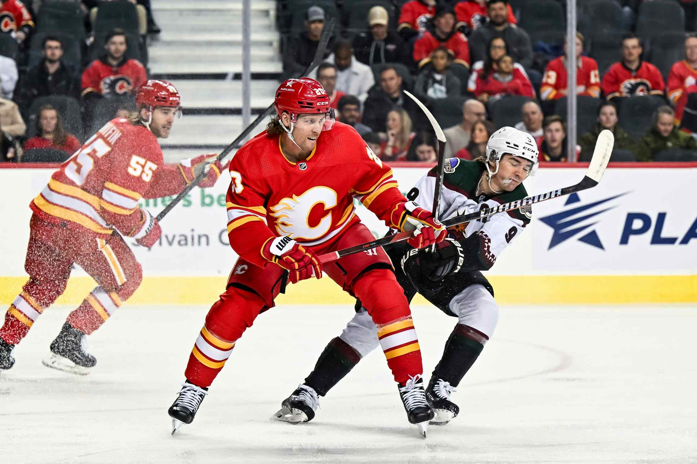
That was partially the case to start this season. The Calgary Flames ditched their old third jerseys – the ones with the wordmark awkwardly punctuated by their own logo (who uses a “C” as a period?) – in favour of returning to the jerseys that everybody loves: the retros.
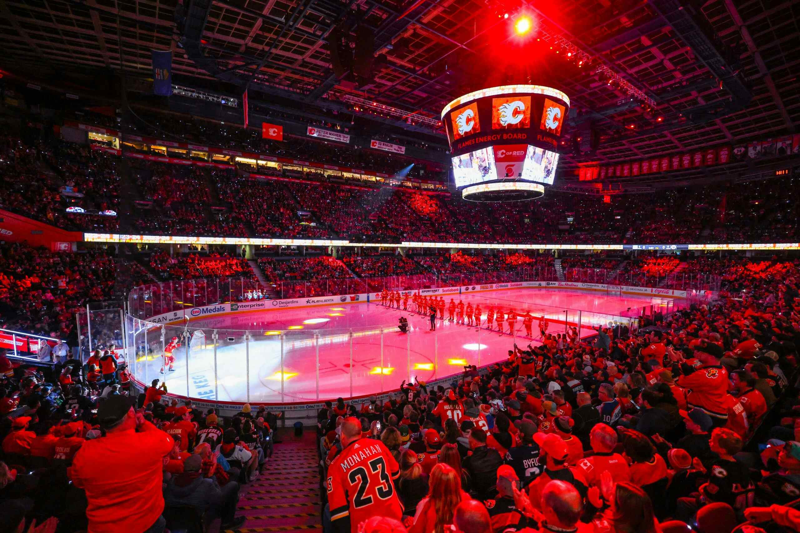
Look at that uniform! Look. It’s beautiful. It’s by far the best jersey the Flames have to offer.
Now imagine it – and a matching away set – being what the Flames wear full time. For the entire season. It’s certainly possible. As the NHL looks to switch over to Adidas jerseys, Adidas looks to nix alternate uniforms for the entire NHL. And that means teams had better get this right, or else we’ll be seeing 82 games of ugly.
The Flames have the chance to get this right. They made a step in the right direction by bringing back the retros this season. Just one more step, guys.
Now, this doesn’t mean no alternates ever again. After all, as is pointed out in the linked piece, Adidas will be making 62 new sets of jerseys: two for each of the NHL’s 31 teams. That’s going to take a lot of effort. There may be alternates again in the not-too-distant future, but for now, there’s only so much rebranding anyone can do at this point in time.
This shouldn’t be too difficult a switch for the Flames, though. They already have a beloved uniform set, and they’ve had them since, oh, the beginning of their existence or so. The Reebok jerseys have been fine – not incredible or anything, but not hideous – but they’re a bit too busy.
What’s the deal with the piping, anyway? Completely unnecessary. Why do they need black? If you consider white and black as colours – which they aren’t, technically – then that’s four different colours the Flames have in their uniforms.
It’s wholly unnecessary; three is just fine. Look back up at the above retro: it pops in part because of how simple it is. It takes two bright, bold colours – colours associated with fire, even! – throws in a bit of white to calm things down just enough, and bam. That’s all you need. It’s a clean look, unmarred by unnecessary elements that just serve to complicate things without any real benefit to them.
Black started creeping into the Flames’ uniforms in 1995, when they debuted their pedestal uniforms. (Note to Adidas and the Flames: the retros make it very easy to incorporate the whole three stripes thing. Do not use a pedestal.) It was used as a light accent – nowhere near as prominent as the Flames’ traditional colours, hockey pants aside – and started to complicate things.
The jerseys still popped on the basis that they’re a bright red, but they stopped to stand quite as well on their own merits. There’s way too much going on there, and for no reason.
The Flames really started to embrace black in 1998, with the creation of their first ever alternates: a black set featuring a horse we like to call Ol’ Blasty. These jerseys actually have a little more pop to them, and I’ll hazard a guess as to why: three colours, with very mild amounts of white as a border. They aren’t complicated. They’re very clearly blocked with fringes of yellow to add just a little bit more – just a little – and that’s it. Note how it’s once again the logo’s main colour being used as an accent on the rest of the set, too.
It’s not the traditional Flames logo, and it’s not necessarily desirable to have black uniforms when your team is literally named after fire, but they have their own distinct look and it’s nice to see every now and then. You know – like a good alternate jersey should be.
Then, from 2000-03, they became the Flames’ home jerseys, and… nah.
In 2003 the Flames switched back to regular red home jerseys, but for the first time with very pronounced black elements. The black is, at least, clearly defined: pants. The base of the jersey and its sleeves. Thick striping on the socks. And, for the first time, the logo. The jerseys are a bit busier, but the blocking is solid and there aren’t any unnecessary elements wandering about in the form of, say, piping. It still finds a way to work.
Which brings us back to today’s efforts, and the ones we will soon be bidding farewell to: just an inane, unnecessary amount of detail when the Flames have a very simple three-tone option to tweak to Adidas’ specifications, and then just go with that.
So please, Flames, I implore of you: you only get home and away jerseys next season? The retro jerseys are objectively better than everything else you’ve ever done. The Flames don’t need black. Please give us 82 games without it.
Recent articles from Ari Yanover