New Flames jersey revealed
By Ari Yanover
6 years agoAt long last, the big day is here. Well… one of them.
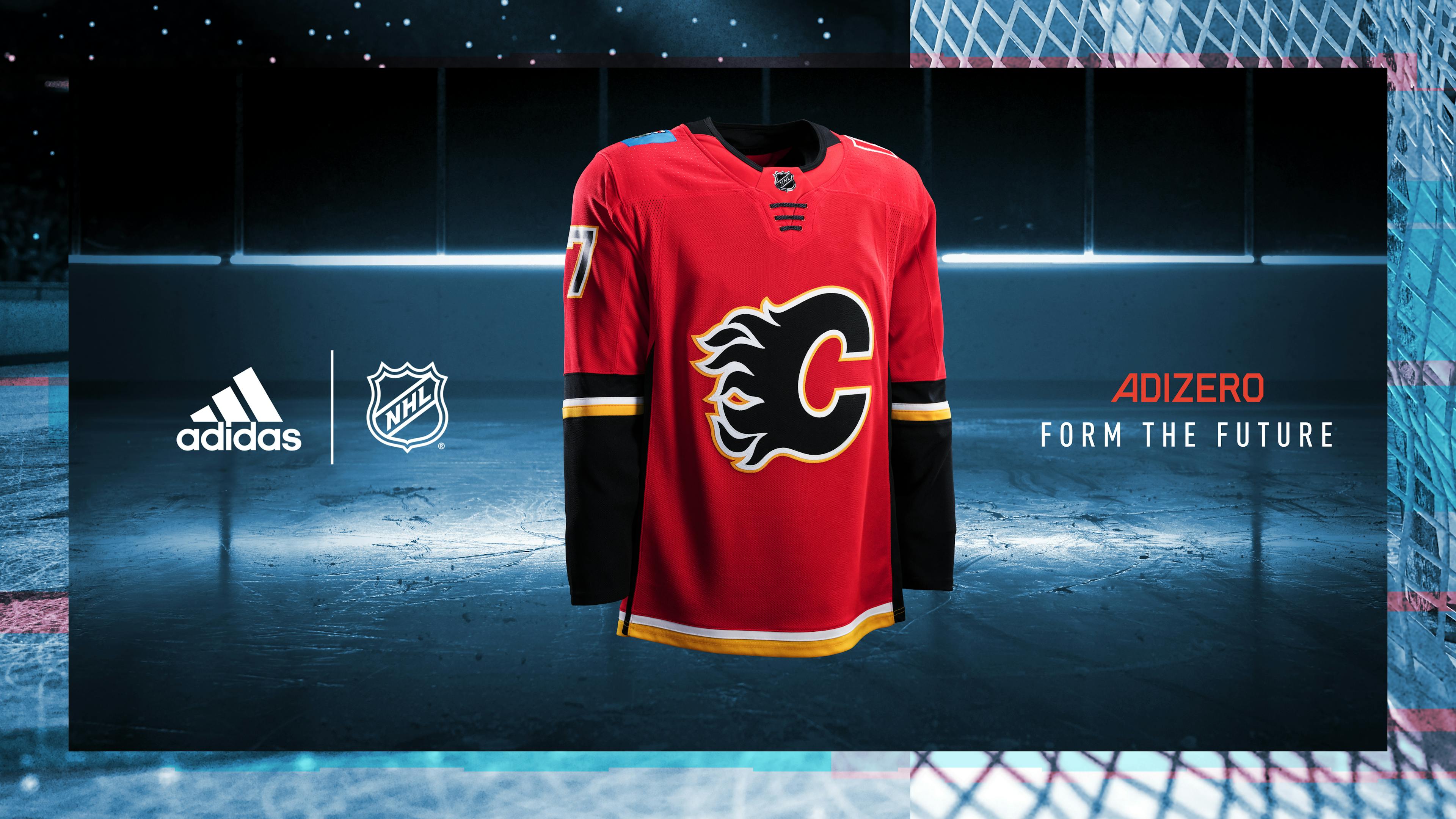
Between the trade deadline, expansion draft, entry draft, and free agency, it’s an exceptionally busy start to the NHL offseason this year. But there’s one more event sandwiched in: new jerseys, for all 31 (!) NHL teams. As the league has made the switch from Reebok to Adidas, everyone has an updated look, and that includes the Flames.
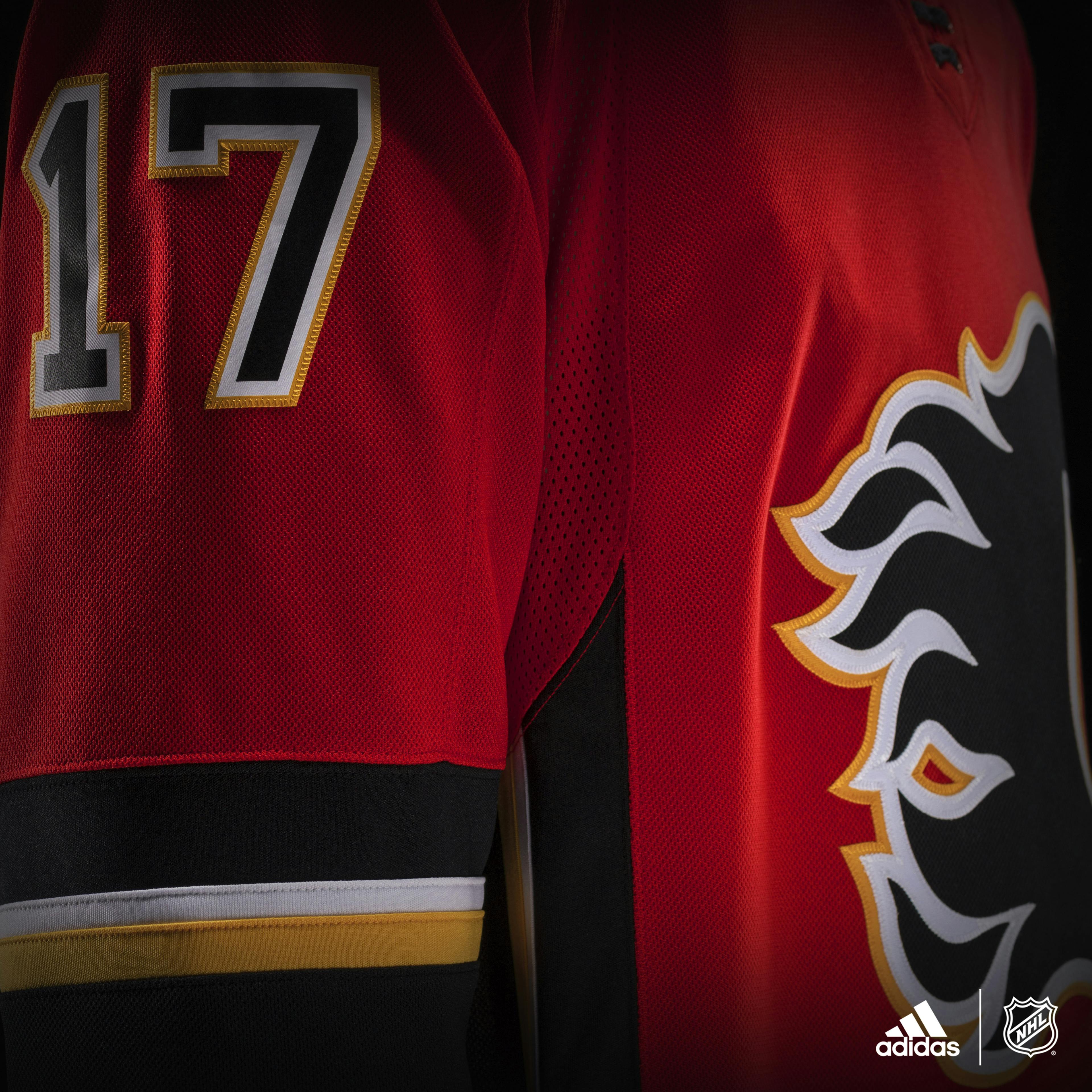
No, they aren’t retros – much to the disappointment of many (check the mentions on an official Flames tweet teasing the new jersey, they are an angry place) – they’re more of a tweak than anything else.
What works
- It’s simple. Red is the base colour, black is prominent on the sleeves and logo, and yellow and white are well used as accents.
- The incessant piping is gone. I think I’m a fan of the black along the sides running higher up, too, though it’s hard to tell from what they’ve given us here.
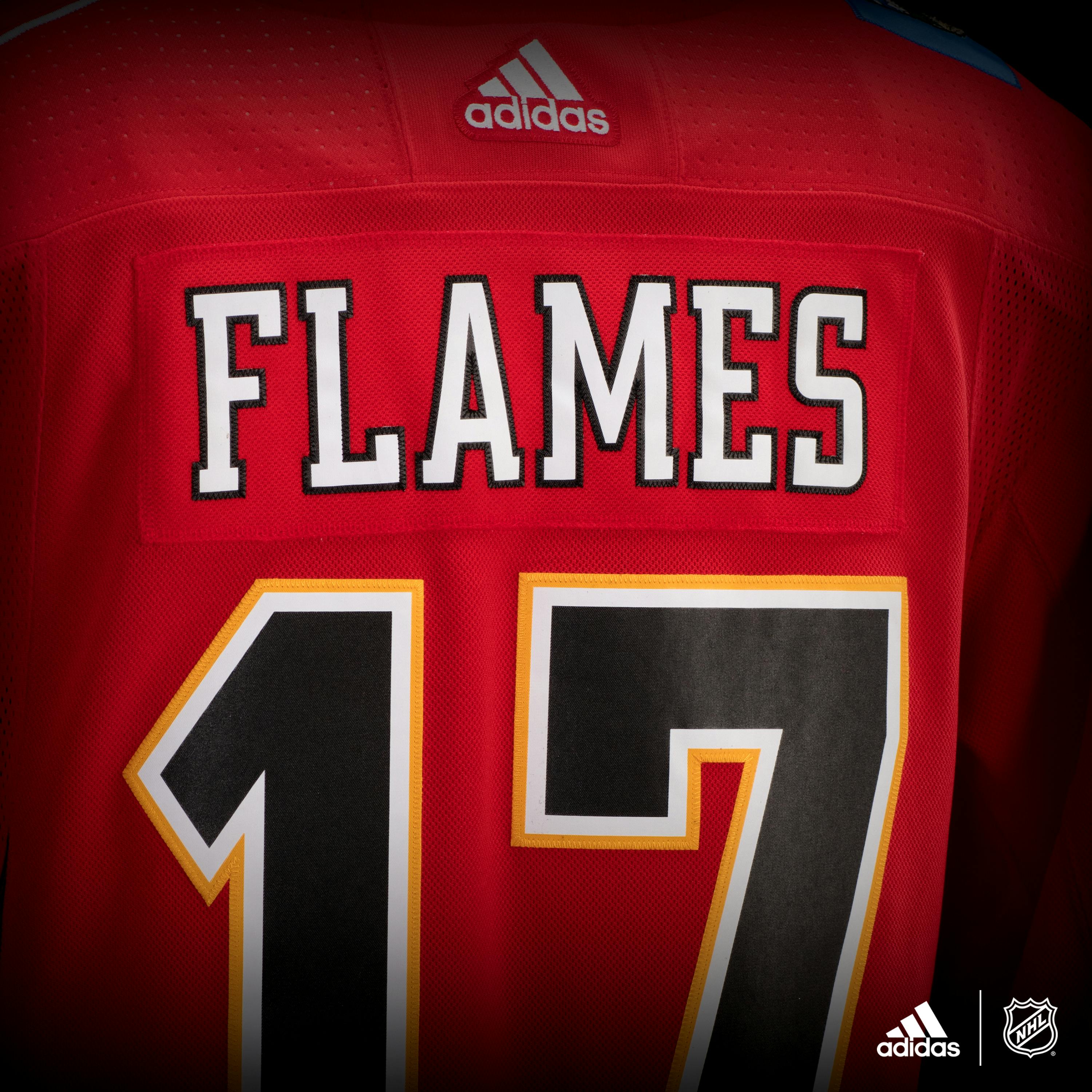
- It’s legible. This is such an obvious thing to get right, but you know, thank goodness they did, because it’s also surprisingly easy to mess up. The Flames’ numbers are big and clear, their names should be easy to read. That’s pretty important, so kudos for not bungling that.
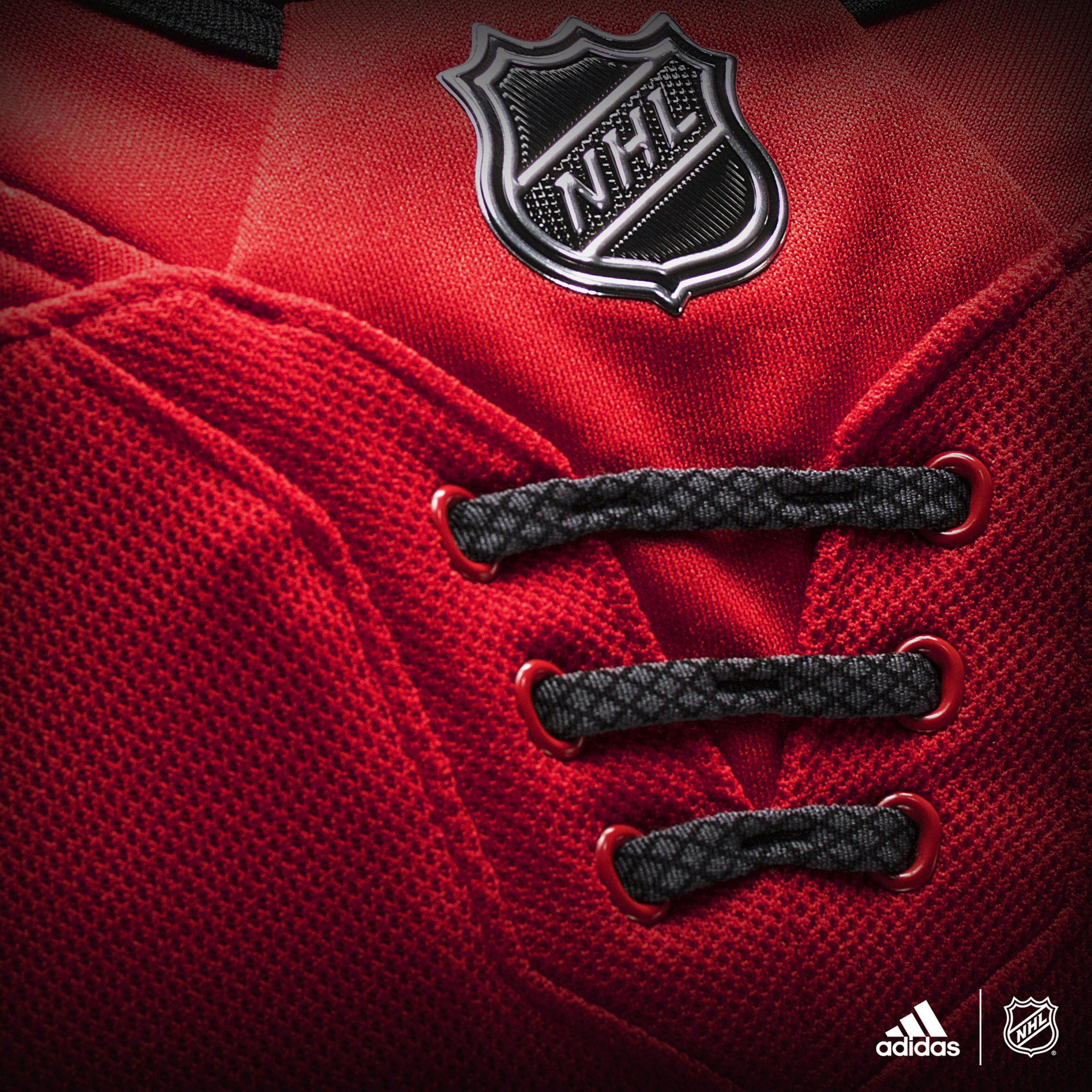
- The laces. This is more personal opinion than anything, but I’m pro-laces, and it’s not like they’re obnoxiously placed or anything. Besides, they provide a nice bit of a breakup which is needed because, well…
 |  |  |
What doesn’t work
- The collar. What is the point of that, exactly? Here’s a thin black strip that turns even thinner for no apparent reason. If you’re going to bother with it at all try having it have actual definition. Or at least make it even. Or – I wasn’t a big fan of the old script third jerseys, but I liked the black shoulders and the patch instead of the flags. The fact that you can see the stitching but they chose to just keep it completely red is especially aggravating. Why?
- The Captain’s ‘C’. What the heck happened here? The Flames use a dual outline on their logo, which, fair enough, the white-yellow combination works on bigger pieces. The captain’s ‘C’ is as thick as just one of the outlines. It makes it look like a fake knockoff. I pray they kept the Atlanta ‘A’ for the alternates, but I shudder to think of what they might look like if this is the ‘C’. There was no reason to do this.
Overall
The Flames and Adidas played it safe with this one, keeping their current jersey design and not really doing anything to it. It’s a little more streamlined, which is good, but they somehow got the small details wrong more than anything else, which is baffling. It probably would have taken less work or innovation to nail it, and yet…
All in all, unless you’re a jersey collector or absolutely in love with this update, there’s no reason to go out and buy a new one (especially as I believe Reebok jerseys should continue to be on sale, as they’re now outdated).
It’s not a horrible monstrosity, nor is it particularly beautiful. It’s passable. The Flames will play hockey in it. And that’s about it.
The away ones look nice, though.
Recent articles from Ari Yanover

