
Nation Sites
The Nation Network
FlamesNation has no direct affiliation to the Calgary Flames, Calgary Sports and Entertainment, NHL, or NHLPA
Looking at street level engagement in recent arenas

Friends, the Calgary Flames’ arena saga will functionally come to a close on Thursday afternoon. The arena’s development permit application will go before the Calgary Planning Commission and is widely expected to pass, albeit with 15 pages of conditions – primarily technical and engineering-related, including incorporating some solar panels into the roof design.
One of the common criticisms of the design is that there’s not a ton of engagement between the facility and the street level or things to do at the building when events aren’t happening, aside from a restaurant space and some retail on the west side of the building. But when you look at the various arenas built since 2000, that’s not an uncommon occurrence.
(Photos here are via Google Street View.)
UBS Arena (Islanders)
Designed by Populous, this arena opens next week so we won’t dive into this too much. Suffice it to say this: it’s an arena dropped into the space between a horse racing track, some parking lots, and a freeway. It’s not really meant for street engagement or foot traffic, nor does it deliver those.
Climate Pledge Arena (Kraken)
Seattle’s arena doesn’t really count, as it was built originally and the ’60s and then renovated at great expense to house the Kraken (with a design by Populous). There are nice windows at either side of the arena and it’s surrounded by some cool stuff in the Seattle Center area – the Museum of Pop Culture is awesome – but if the hockey team’s not playing there’s not much to engage with at the arena.
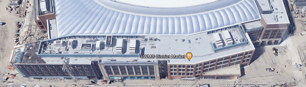
Little Caesars Arena (Red Wings)
Designed by HOK and opened in 2017, Little Caesars Arena was part of a lot of spending by Detroit’s government in trying to get people downtown – it’s located across the freeway from the city’s baseball and football stadiums. One side of the building has a cool “main street” feel, with some eateries and retail, but most of the street life is located closer to the other stadiums, and aside from the one side there’s not much to bring people in and around the facility on non-game days.
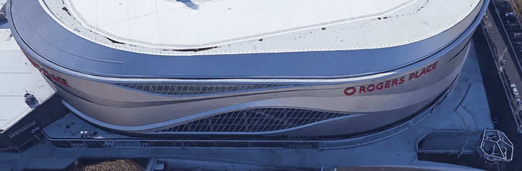
Rogers Place (Oilers)
Designed by HOK (360 Architecture) and opened in 2016, Rogers Place is slick, space-shippy, but only really has street-level engagement on the one side facing the street – and even that is just the main doors and a series of windows. One side is shared with the casino next door, and the other two are just more exterior windows without much to draw folks inside on non-game days.
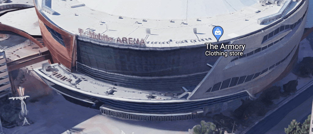
T-Mobile Arena (Golden Knights)
T-Mobile Arena was designed by Populous and opened in 2016. I’ll say this: the front entrance area with Toshiba Plaza and the big display board is excellent – and the display board is a feature the new Calgary arena is gleefully aping via a projection system on the exterior “ribbon” facing the southwest side. It’s just a really great public space and buzzing before games or concerts (though a bit quiet on non-event days). But aside from Toshiba Plaza’s entrance and team store, the remainder of T-Mobile’s exterior has nothing to engage with.
The best things to engage with this arena are the things around it – the Park MGM developments – which were built and funded separately. The best thing that was done was putting this arena nearby all the cool stuff on that was already on the Vegas Strip.
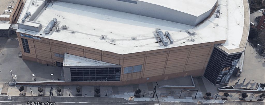
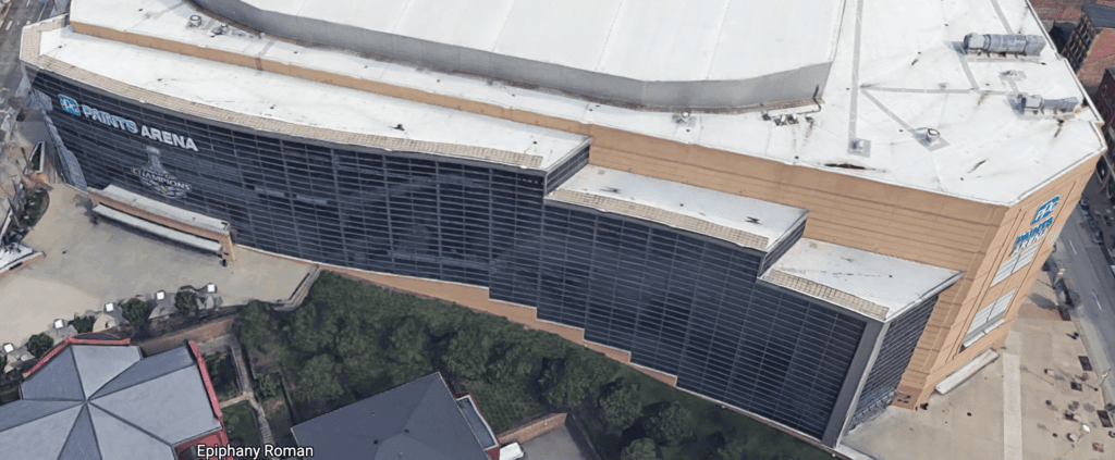
PPG Paints Arena (Penguins)
Designed by Populous and opened in 2010, PPG Paints Arena is a bit of a throwback from a design sense. It has nice entrances, but most of the exterior is big, blank brick walls (or big glass facades) and there’s very little in the design to draw anybody to the space when games aren’t going on.
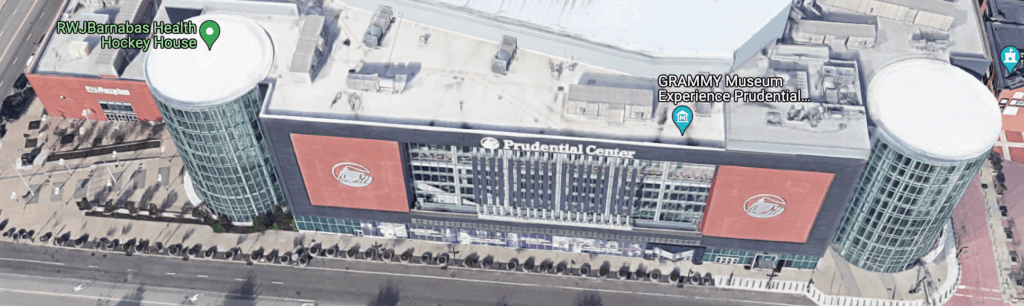
Prudential Center (Devils)
Prudential Center in Newark was designed by Populous and opened in 2007. It has a couple smartly-designed plaza areas on two sides of the building, one fronting onto the main arena entrance and the other onto the entrance of their practice arena. The other two walls are fairly blank, one with some big windows and the other one functionally an alleyway with nothing to engage with besides brick walls.
The public spaces built around Prudential are pretty nice, but they don’t have a ton of things to engage with beyond the team store and the practice rink. They are also unfortunately in downtown Newark, which usually isn’t a place where folks want to spend tons of time on the streets.
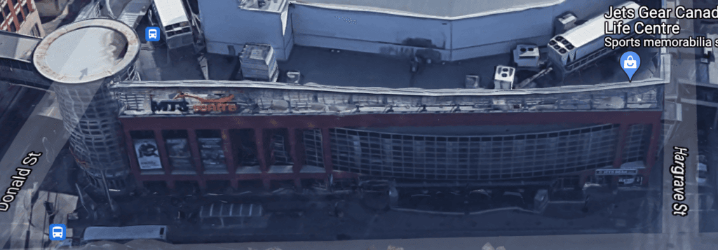
Canada Life Centre (Jets)
Opened in 2004 in downtown Winnipeg and designed by a trio of firms (Sink Combs Detlefs, Number 10 Architectural and Smith Carter), Canada Life Centre is a compact building built right in downtown Winnipeg. It doesn’t have a big footprint so there’s not a lot of space for public plazas, but they did a fairly good job in integrating a restaurant and a team store. Two and a half sides of the building are fairly bland blank walls and windows aside from entrances into the facility, but given the constraints they did a decent job with it.
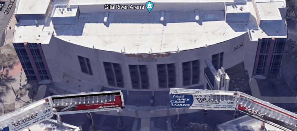
Gila River Arena (Coyotes)
Designed by Populous (HOK Sport) and opened in 2003, Gila River is in the Glendale entertainment district in suburban Phoenix. The building is surrounded by some cool stuff in terms of bars, restaurants and other attractions, but the building itself just has entrances and not much else on the street level to engage with without going into the building for a game.
(And the series of billboards beside the front entrance is super odd to me.)
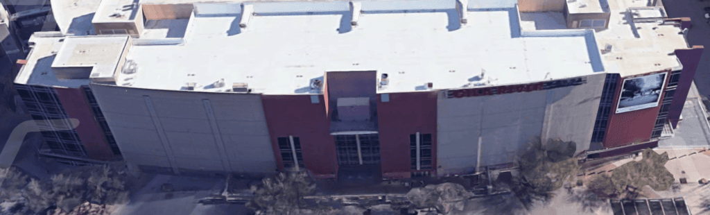
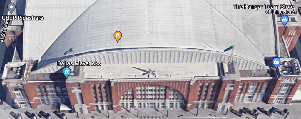
American Airlines Center (Stars)
Designed by David M. Schwartz and opened in 2001, American Airlines Center is a gorgeous-looking, stylish, fortressy arena with nothing much around it in terms of street-level engagement. There’s a team store, but beyond that it’s just a cool-looking building with no way to engage with it beyond events at the building.
(All four sides basically look like this.)
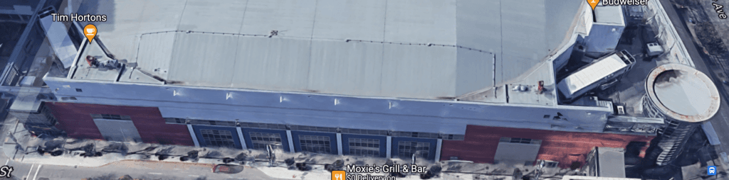
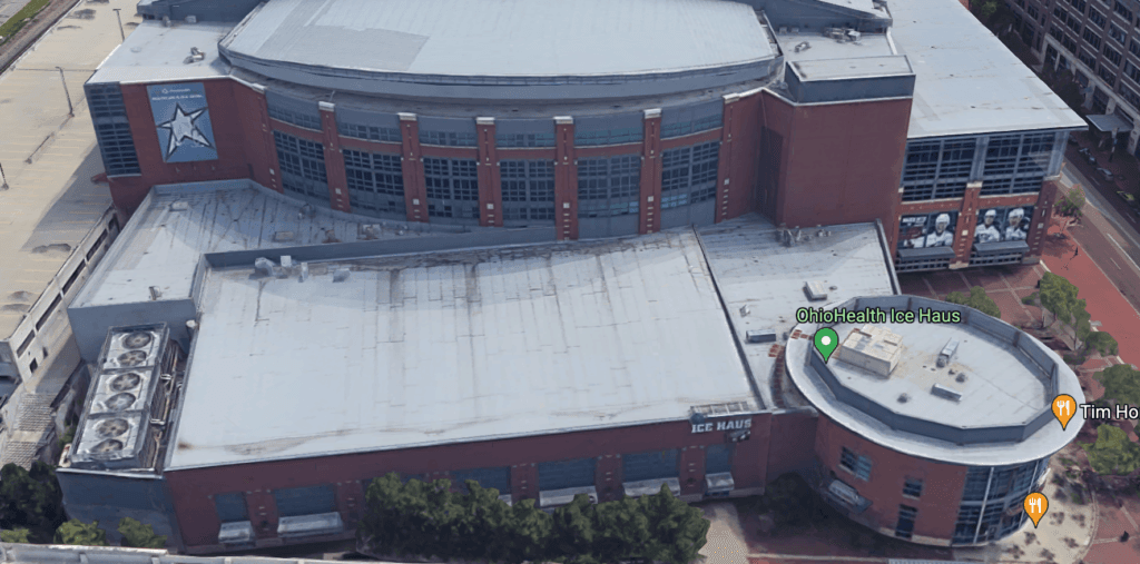
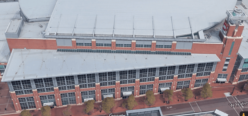
Nationwide Arena (Blue Jackets)
Opened in 2000 and designed by HOK (Heinlein Schrock Stearns), Nationwide Arena was seemingly dropped into whatever space was available for it in downtown Columbus. One side is bordering on their parkade and one side is primarily blank walls and windows, but they did a nice job on the other two sides: there are a couple entrance plazas, and one side features the team store, a Tim Hortons and the practice rink. It’s not perfect, but there’s a decent amount of things to engage with.
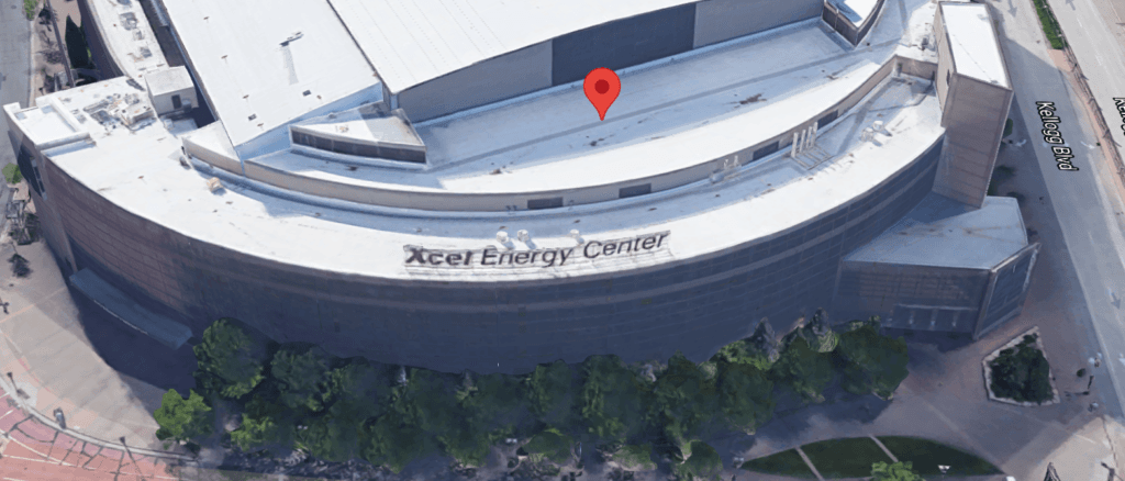
Xcel Energy Center (Wild)
Designed by Populous (HOK Sport) and opened in 2000, the Xcel Energy Center is one of the better-designed buildings in the NHL. It’s also not great on the outside. Two of the three external walls are just bare brick, the third is mostly a big glass facade and besides the gates into the arena there’s nothing to engage with on the street level. The nice plazas are basically just queuing areas to get in rather than useful public realm additions.
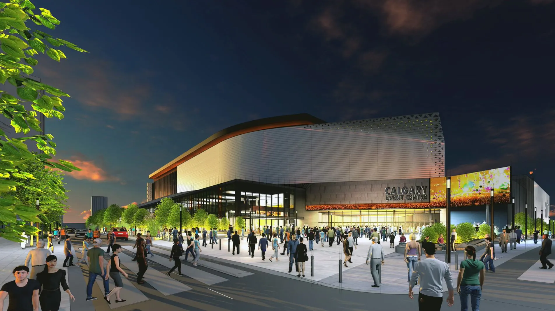
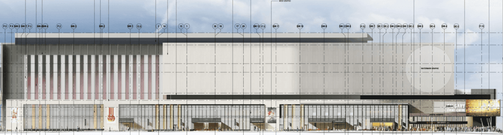
The Calgary arena
Dialog and HOK, who previously teamed up for Rogers Place, designed the new Calgary building. With the strengths and weaknesses of the last 20 years of buildings in mind, let’s dive in. (Photos via the City of Calgary development office.)
12th Avenue side (north side of arena):
This side has two entrances, along with some ground-level windows facing some retail and food outlets. This will also be the side with the bus stop and transportation drop-offs (e.g., cabs, Ubers).
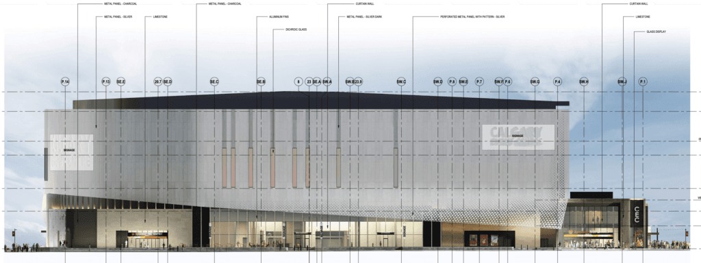
5th Avenue side (east side of arena):
This side is arguably the weakest of the four, dominated somewhat by the entrance to the parkade and loading docks. Some windows have been added, along with some exterior petroglyph designs that should make the blank walls a little bit more engaging. There’s also some design elements added to the crosswalk that approaches the entrance to the arena, which is likely in the hopes of making it a bit more of a lively public area. (The challenge of this side will be the traffic to and from the parkade from 12th Avenue, though.)

14th Avenue side (south side of arena):
The good news here is this side will benefit from the proximity to the main entrance on the southwest corner and the Stampede Trail foot traffic and revelry. The parkade dominates this side a bit, but they’ve done what they can to jazz up its facade and add some artistic elements.
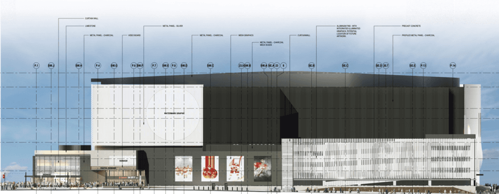
Stampede Trail/Olympic Way (west side):
This is the fun side. It’s across the street from the casino and the BMO Centre (and eventually a hotel). It has a restaurant and the team store and the main entrance. The “ribbon” element mentioned previously is primarily on this side and can be projected upon, so aside from the graphics at the entrance there will be some things to gawk at and engage with on this side. (It’s also likely to have the most foot traffic, as folks hoof it to the Green Line LRT station to the north or the Victoria Park LRT station to the west.)
Is the design perfect? Well, no. But a perfect arena design probably doesn’t exist from a street life perspective, and having two fairly good sides in terms of public realm engagement (Stampede Trail and 12th Avenue) is pretty good by these standards.
The arena design benefits from the loading dock and traditional “service level” facilities being put below grade under the parkade, which minimizes how much street space is eaten up – the back third of the Saddledome is service-level stuff and it’s a bit challenging in terms of making the area feel alive and engaging. If nothing else, the Calgary building seems to have a lot of potential for public realm engagement on the north and west sides, especially by the utilitarian design standards of modern NHL arenas.
It’ll be up to the Calgary Municipal Land Corporation, the Stampede and the city to make sure that potential is actually realized.
Breaking News
- Looking at some unique Flames holiday history
- Flames weekly notebook: Rasmus Andersson has been excellent
- Flames Prospect Roundup: How the standings shape up entering the holiday break
- NHL Notebook: Sidney Crosby takes sole possession of most points in Penguins’ franchise history
- FlamesNation Mailbag: Waiting for Santa with reader questions