
Nation Sites
The Nation Network
FlamesNation has no direct affiliation to the Calgary Flames, Calgary Sports and Entertainment, NHL, or NHLPA
A brief history of Flames jerseys
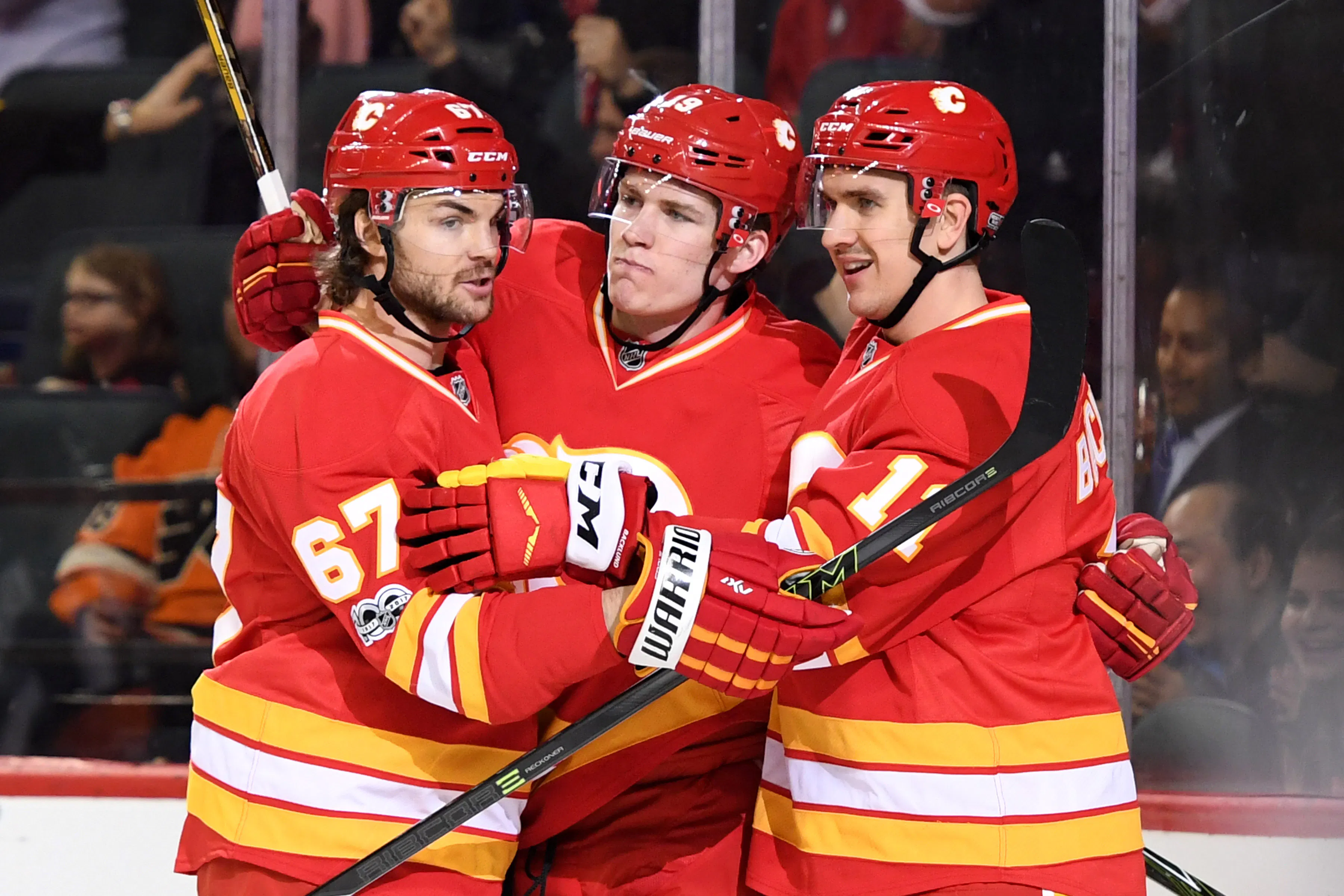
Photo credit: Candice Ward-USA TODAY Sports

The Calgary Flames are officially unveiling their third jersey later today. While few details have leaked out about it, looking at history is generally a pretty good way of predicting the future. In an effort of sussing out what the Flames’ new – probably red – jersey will look like, let’s take a trip down memory lane at their previous, primarily red, jerseys.
The classic reds
What: Red sweaters with white and orange stripes, white crest (Flaming C or Flaming A).
Worn: 1972-80 (Atlanta), 1980-94, 2009-13 (alternates), 2016-17 (alternates)
Verdict: This is the best jersey the Flames have ever worn. They went to two Stanley Cup Finals in these sweaters – and won a Cup in Montreal in them – and it’s just a simple, uncluttered, classic look.
The classic whites
What: White sweaters with red and orange stripes, red crest (Flaming C or Flaming A), red shoulders.
Worn: 1972-80 (Atlanta), 1980-94
Verdict: Loved slightly less by fans than the classic reds, the whites are arguably an unappreciated masterpiece. They haven’t been brought back since they stopped being used full-time, likely due to the need to have red alternate jerseys for use at home.
The pedestal jerseys
What: Red sweaters with diagonal white, orange and black stripes, white crest, white shoulders AND white sweaters with diagonal red, orange and black stripes, red crest, red shoulders.
Worn: 1995-2000
Verdict: In the mid-’90s, the trend in jerseys was taking classic looks and making them worse – usually by adding stripes and gradients. The Flames added black to their colour palate, and then put some of their striping at an angle (creating a “pedestal”) to accent the crest. They also added additional shoulder striping on the home jersey, causing a clean look to look a little too busy.
The Horse Head (“Blasty”)
What: Alternate jersey introduced for “the Year of the Cowboy”; black jersey with “Flaming Horse Head” crest, red and orange striping; traditional red C on shoulders.
Worn: 1998-2006
Verdict: “Blasty” might be the most popular jersey that everyone originally hated. Originally not beloved – because it was not red – the black Horse Head jersey has become popular after the fact because it was a pretty decent design. The logo wasn’t amazing, though, with some describing it as “a horse with flaming boogers” or “a sneezing dragon.”
The 2000s whites
What: White jersey with red, black and orange striping similar to Horse Head, red crest; Horse Head logo on shoulders.
Worn: 2000-07
Verdict: The redesigned white jerseys weren’t amazing, but they were pretty clean. The designers just ported over the exact design of the black jerseys and changed around some colours.
The 2000s reds
What: Red jersey with white, black and orange striping similar to Horse Head, black crest; Horse Head logo on shoulders.
Worn: 2003-07
Verdict: Under any under circumstances a black C might’ve been heresy – until this point they had only ever worn red or white Cs – but the league swapped dark jerseys as the home jerseys beginning with this season and the C of Red was born as the team marched to the Stanley Cup Final. This has largely formed the basis for the modern team colour scheme, with minor variations.
The Reebok Edge/Adidas Era

What: Slight redesigns of the 2000s red and white jerseys, Alberta and Canada flags on shoulders.
Worn: 2007-present
Verdict: This era represents two minor redesigns of the 2000 white jersey and the 2003 red jersey, with piping added in for the Reebok Edge re-design and then removed several years later during the Adidas re-design. The striping is a little bit cleaner than the prior designs, but the shoulder flags are a rather blah design choice.
Script alternate red
What: Red alternate jersey with western-style black shoulders, script-style “Calgary” crest, new alternate logo on shoulders.
Worn: 2013-16
Verdict: Arguably the jersey that was received the most negatively in franchise history – fans were clamouring for the vintage reds and ended up getting a jersey that tried to look like a cowboy shirt. While the jersey wasn’t great and the script logo was a misstep, the shoulder logo was pretty sharp.
Breaking News
- Instant Reaction: Flames smother Lightning in overtime
- Panthers’ A.J. Greer suspended three games for hit on Flames forward Connor Zary
- 🍫 Barn Burner Chocolate Championship: Wild Card Round is LIVE
- 8 Flames college prospects taking part in NCAA national championship tournament
- Flames lineup news: Tyson Gross to make NHL debut on Sunday against Tampa Bay