Wild speculation about the new third jersey

5 years ago
One of the last big thing on the Flames’ agenda is the Noah Hanifin signing. It’s been on the to-do list since they acquired him back in June, and they’ve done pretty much anything and everything since except the extension.
Which leaves lots of time for wondering and speculating. At FlamesNation, we’ve mapped out what long- and short-term contracts for Hanifin could look like. With complete radio silence, all we can do is wait and see which scenario ends up being the right one.
So while we wait for something on the Hanifin front, we might as well fill the void by talking about the other big mystery of offseason 2018: the new third jerseys. It certainly hasn’t been as talked about, but it’s still a pretty pressing topic.
So what will the Flames look like for maybe eight to 12 games next year?
The tried and true
The Flames have tried a few different alternate jerseys throughout the years, but only the retros seem to have any staying power. They’ve tried to phase them out (see 2013-14) but you can’t hold down a legend. The people want them, and the people must be listened to.
Which makes sense. They’re classics, after all. They’ve won a Cup in these colours and saw many of their best years in these getups. It’s quite literally a winning combination. It seems to be the most obvious choice.
Allow me to be cynical, however. These are the most popular Flames jerseys and pretty much every legendary player who has played for the Flames has suited up in them. If you have a favourite Flame, you likely own his jersey, and you likely own the retro version of it. So there’s little to no marketing potential there, which makes releasing a new third a more palatable option for the powers that be.
One of the reasons for introducing a new jersey is because people will buy the new jersey – we’re suckers like that! What’s the point of releasing something everybody already has? Even if you factor in new players’ jerseys (i.e. James Neal, Hanifin), you’re kind of only pandering to collectors. How many people are willing to slap down ~$250 for a jersey they already have, but with a different name on the back?
From a fan perspective, the retro is an obvious choice. From a business perspective, not the best. Not saying that you should abandon hope (I’m honestly in favour of everyone boosting their hopes: we should push for retros as the permanent home and away jerseys), but perhaps the obvious choice isn’t the one they’re going with.
Perhaps a visit from an old friend…
If I have to be honest, the alternate jerseys unveiled thus far have me thinking that Adidas might have a different direction planned for the Flames. Perhaps I’m reading too deep into five of the supposed 19 third jerseys to be unveiled, but there are some trends emerging that may point to the return of Ol’ Blasty/the horsehead/whatever you want to call it:
1. Black is back
Of the five thirds revealed so far, five have been black jerseys. Quite an easy trend to spot. The Ol’ Blasty jersey was also born from a black jersey trend. When the 1990-91 season began, only four teams had black jerseys but by the time Blasty came around, 12 teams had adopted them. If black is where the NHL is going, the Flames could be going that direction, too.
2. 90s retro
The Canucks and Coyotes are going back to their familiar jerseys of the 90s, while the Ducks are putting a spin on their classic logo and colours from the era. It’s unlikely the Flames would go back to the pedestal jerseys (or could they? It’s a speculation post after all) so perhaps Blasty has some more help in his corner.
3. The goalies are loading up on the black, too
Have you seen Tyler Parsons’ new pads?
An intriguing mix of Flames red and yellow with black. Sounds just like a jersey we all know and love.
By the way, have you seen Mike Smith’s new mask?
Also heavily featuring black. Hm…
(David Rittich and Jon Gillies haven’t released their masks and pads looks yet, so small sample size alert.)
Perhaps reading a bit too deep into things, but it seems like black is an early theme in goalie gear. Maybe the Flames tipped the goalies to a potential future jersey and gave them time to coordinate the rest of their looks.
Although it’s not necessarily indicative of anything besides me having too much time on my hands. Smith had black pads this previous season and his mask is his pretty standard combination of superheroes, his kids, and the team he plays for. Parsons is likely going to spend all of next year in the minors, where both Flames affiliates own black jerseys (although, he wore white Flames-style pads last season regardless).
4. Johnny Gaudreau liked an Instagram photo featuring a photoshop of Sean Monahan in an Ol’ Blasty jersey
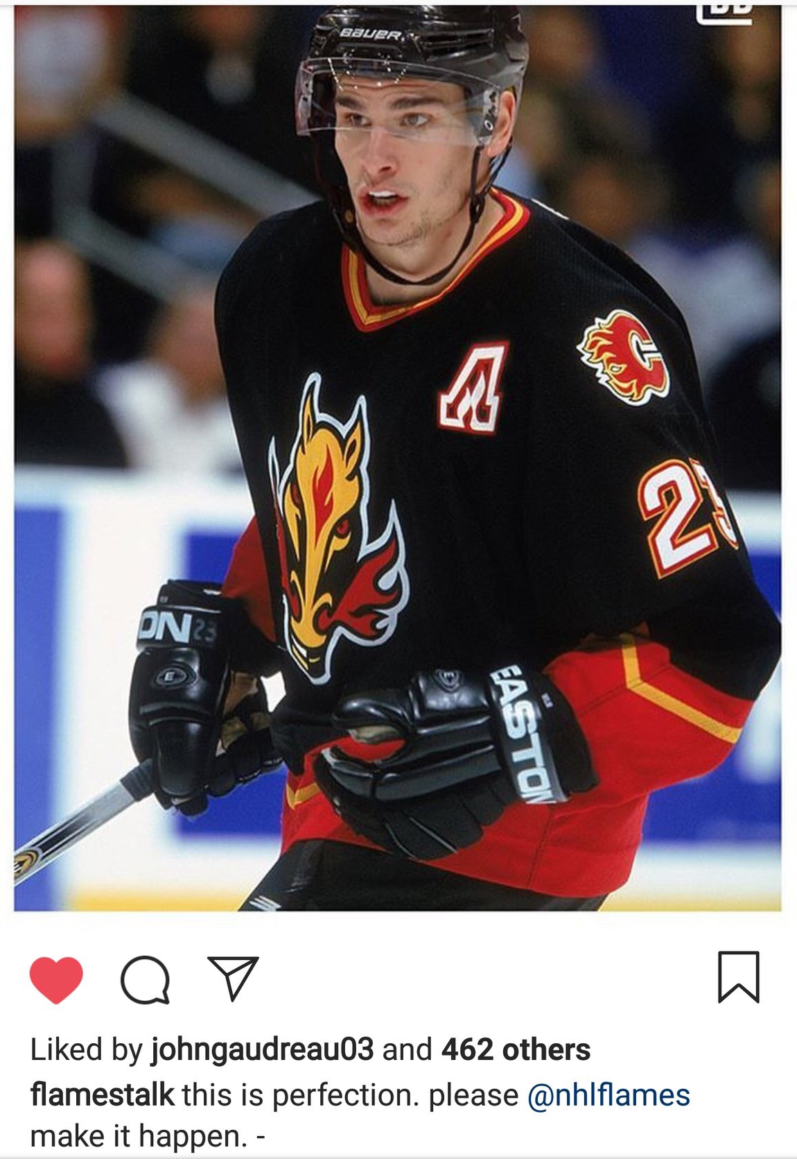
As we all know, Instagram likes are irrefutable evidence (they aren’t). The proof’s in the pudding (not really, but could you imagine if Gaudreau did accidentally leak the jerseys via social media? Almost equally as disastrous as this)!
Not Ol’ Blasty, but still following the trends
So perhaps Smith and Parsons do know more than we do, and perhaps the Flames are getting a black jersey after all. Maybe it’s at least somewhat 90s inspired. That doesn’t necessarily mean they’re bringing the horsehead back.
Perhaps they go with a black jersey of some kind. Hopefully it’s not like the minimalist sweater the Islanders wore two seasons ago. Maybe it’s a remix on an old design like what Adidas did with the Ducks (black pedestal jerseys?). It could just be like the Flyers’ new alternate jersey: the regular jersey, but black.
There’s a lot you can do with a black jersey (see above) and if Adidas is so far insistent on the new thirds being black, then it’s up to your imagination.
Something completely out of left field that no one can guess and everyone is disappointed with
Remember in 2013-14 when the Flames randomly decided to get new third jerseys despite already having perfectly fine retro jerseys? Perhaps it wasn’t an awful idea to change things up and do a little rebranding, given the state of the franchise (first post-Iginla year, first year they actually kind of acknowledged they needed to rebuild), but the result would’ve had to been better than the retros, and that’s a high bar to clear.
They did not clear that bar.
It’s certainly not the worst thing in the world: the shoulder patch is still an interesting concept that could probably be the base for a radically different third jersey design and the piping is pretty clean, but the no-name brand logo kind of kills the entire good and reduces it to Walmart clearance rack fodder. It was unceremoniously announced through an update for the yearly installation of the EA NHL series.
In a season with no expectations, this was a letdown. If they were going to suck, they could at least do us all a favour and look nice doing it. Instead, we got jerseys so cursed, Bob Hartley chose to switch out of them in hope of getting a positive result (he did).
So perhaps we all get a rude surprise that no one predicted and everyone is disappointed by. It’s not unprecedented for them to go wildly off the board. Mustard yellow jerseys? Why not. Return of the Calgary Tigers-inspired Winter Classic jerseys? Sure.
Your turn to speculate. What do you think the Flames should wear as their thirds? Are you expecting the retros, or something completely new? Do you have any wild ideas for the Flames’ get ups? What’s your ideal jersey set up? Have at it.
Recent articles from christian tiberi