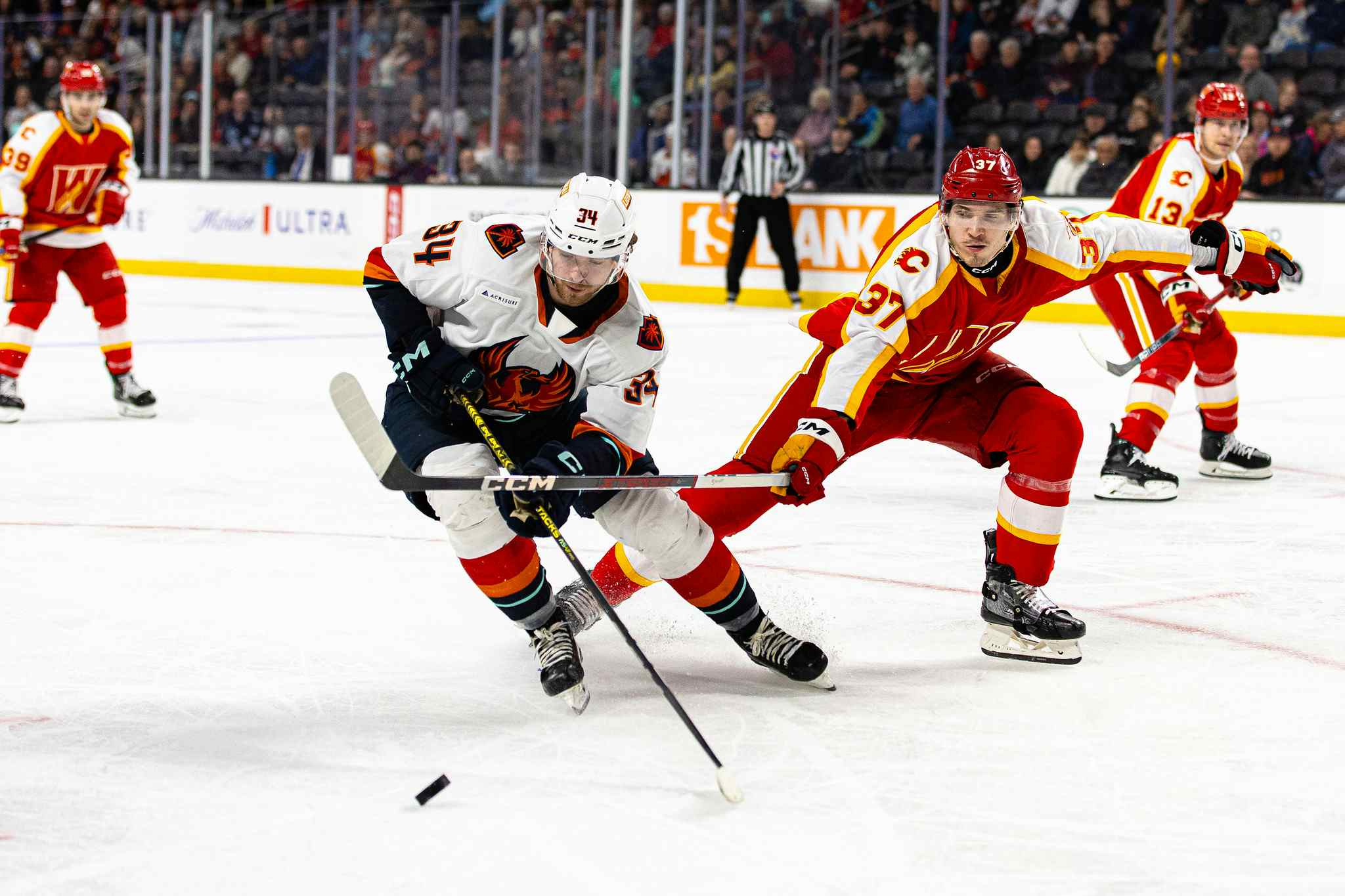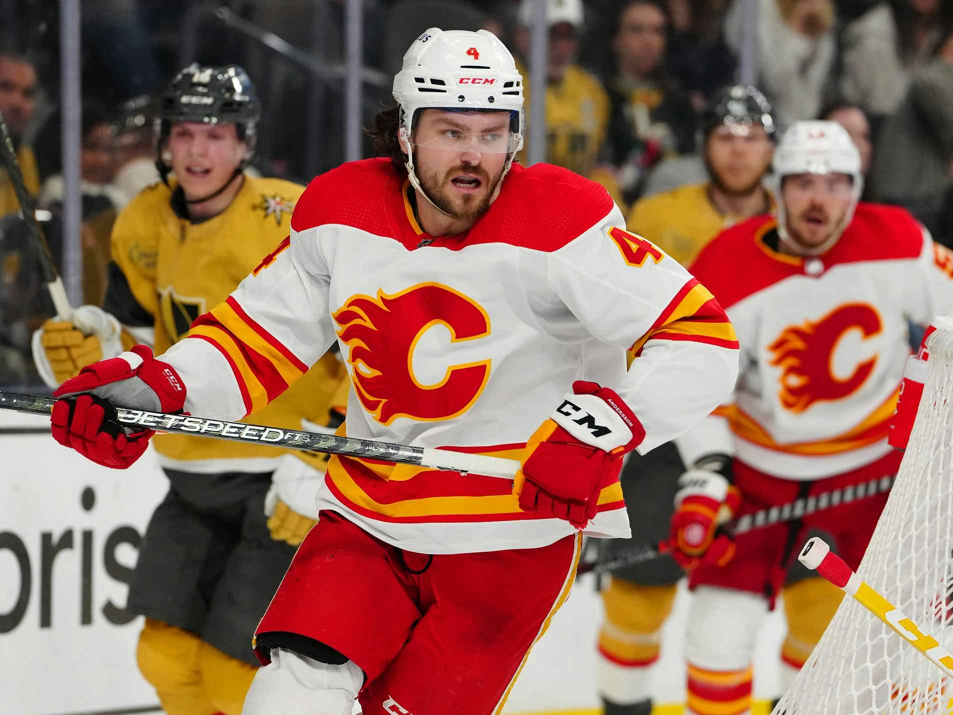
Worst to First Jerseys: The Calgary Flames

By Kent Wilson
11 years ago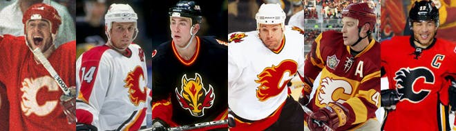
This installment of the Worst to First Jerseys features the Calgary Flames, and much thanks to FlamesNation for letting me guest post on their blog. On my own blog, I talk about about graphic design in hockey and I’ll be doing the rest of the league over time, so come by Hockey By Design to check it out.
By John van der Woude
Any regular reader of my blog knows that I’m a die-hard Canucks fan, but I promise not to let that bias influence me while I rank all the jerseys the Flames ever wore. I will not rank the 1994 home jerseys higher than the 2004 road jerseys, simply because I have better memories from the Flames wearing that jersey. I promise.
Here’s how this works: I’ll count down, from worst to first, all the jerseys the Flames have ever worn. Homes and aways will be lumped into the same category (so, more of a jersey "era") and I won’t worry about small changes (like slightly changed positions of piping for example). Third jerseys will stand on their own. And I’m focusing on the jerseys only, not the entire uniform. The jersey images are compliments of the fine people over at nhluniforms.com. For the Flames, there’s 6 different jerseys/eras. And we’ll start with the worst one:
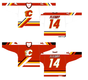
6. 1995-2000 Home and Away Jerseys
The previous team I did this kind of post for was the Canucks, who have had a bunch of different logos and colour schemes over their existence. Calgary is very different in that their logo has never changed and their colour scheme has always been predominantly red and gold, so some of the conversation in this post will be about the details of the jerseys.
But in this jersey, the change in the details from other iterations is pretty obvious. I’m all for not always following conventions and trying new things, but I’m not sure what the designer was thinking – or what their blood-alcohol level was at – when they designed this.
The piping along the bottom of the jersey inexplicably comes angling straight up towards the logo and then bluntly stops. It feels like it was just slapped there with no purpose. If you’re going to try something different or innovative, make sure there’s a reason for it. But this just looks ridiculous and out-of-place.
Anyone who reads my blog knows I generally like simplicity in design, so the other problem I have with the jersey is the crazy amount of stripes happening on the sleeves and base of the jersey. For example, on the white jerseys’ sleeves, it goes yellow, white, black, white, and all different widths, on a red background. It’s just too much and after reading about the rest of the jerseys, you’ll probably agree.
The one thing that this jersey did have going for it was that this is one of the first designs to break the mold in terms of typography and fonts used. Tampa Bay was the first team, in 1994-95, to not have the the standard angled-corner fonts/numbers that literally every team in the league had. And the following year, Calgary (along with Anaheim and LA on their third jerseys, and Washington, on their regular jerseys) tried something new as well. In that sense, this jersey was a bit of a trailblazer.
Jersey Recommendation: #16 Stillman – He was with the Flames almost exclusively while they had this version, and was a relatively solid producer at that time.
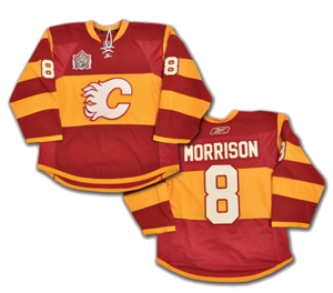
5. 1998-2000, 2003-06 Third Jerseys, 2000-03 Away Jerseys

Third jerseys are a bit of a mixed bag in the NHL. Some are excellent brand extensions for the team and well thought-out. Others, well, not so much. The one and only time Flames have had a third jersey was also the one and only time they used an alternative logo, and the results are pretty middle of the road as third jerseys go.
The alternative logo is cheesy and terrible. Everything that’s good about the Flames’ logo – its simplicity and relative elegance (I discuss the Flames’ regular logo in detail on my blog, which I ranked at #13 in the league) – is destroyed by a red-eyed fire-breathing dragon (or sorry, a horse, which makes even less sense). But whatever you like or dislike about the logo itself, there are issues with the jersey as well.
A lot of team in the late-’90s and early-’00s decided to start pushing out black jerseys, like the Ducks, Senators, Sharks, among others, including the Flames. The problem I have with black jerseys is that then the two dominant colours on the ice is one team in black and one team in white, which is boring, especially when you have a beautiful clean canvas like an ice surface to work with. There’s a reason why the longest-lasting coloured/dark jerseys in the game are not black. To be fair, I’m fine with it when black is one of the team’s main colour, like with Boston or Pittsburgh, although I’m also a big fan of the power blue Penguins jerseys.
So I’m not crazy about the logo or the black base of the jersey. The piping of the jersey, or the V-shaped red bar along the bottom with the yellow stripe is certainly more minimal than the previously-ranked jersey, and it works pretty well, but I’m not convinced it looks great against the black. I know that it’s probably the best colour combination that will work with the team colours and against the black jerseys, but as you’ll see later on, it works a lot better on a red or white background.
Again, kudos on using an alternative font (by 1998, only 8 of the 27 teams were using different fonts from the standard), but I’ve never been crazy about using italics on jerseys. Italics are meant for places of emphasis within blocks of text. Italics, just on their own is, typographically speaking, incorrect. LIKE WHEN PEOPLE ONLY USE ALL-CAPS.
It’s even worse that this jersey became the Flames’ main road jersey for three seasons from 2000-03. When the NHL switched to the road jerseys being white for the 2003-04 season, this (thankfully) again became merely the third jersey and was worn less than usual.
Jersey Recommendation: #22 Conroy – Again, he was with the Flames almost exclusively while they had this jersey, and aside from Iginla, probably their best producer at the time.
4. 2007-present Home and Away Jerseys
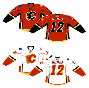
When the NHL introduced the new streamlined Reebok Edge uniforms in 2007, some teams just kept the same design and made it work with the new shape, some teams took the opportunity to redeisgn their jerseys to complement the new shape, and still other teams decided to radically change the idea of hockey jersey piping and trace the new contours of the jersey with colour.
Calgary fell into the last grouping. That’s not necessarily a problem, but it’s more that they combined this new style with the traditional style with mixed results.
The first thing I really like about the jersey, though, is the use of the laces at the collar. It gives a nod to the history of the game in a subtle but meaningful way, making the it look traditional, no matter when it was actually designed. Love it. This is also the first inclusion of the black logo on the red jerseys in this countdown, which I like better than the white logo on the red jerseys that the team has also had. The black logo provides more contrast and makes the logo stand out much more against a sea of white. I wasn’t always a fan of the black logo, but it’s better than the alternative.
Of note, there are only 5 teams in the league that actually change the colours of their logo on their home and away jersey right now: St. Louis, Tampa Bay, Toronto, Vancouver and, of course, Calgary. That’s neither positive or negative, just a common issue for any logo where it’s predominantly (or completely) one colour. Any of the other teams with logos like this (like Detroit, for example), just outline the logo to make it work.
Now to get to my point about the piping on the jersey – there’s just too much happening. The biggest complaint is that the stripes and lines just come to a dead-end. As a counter example, the stripes on the sleeves make sense – looping around the arms – so there is no real beginning or end to them. It’s still too excessive, with black, white, yellow and red and/or black stripes, but at least it makes sense. But elsewhere, you get the single thin stripe (red on the away whites, black on the home reds) that runs from the bottom of the jersey, and then curves around the arm…and then just stops, like a half-cooked spaghetti strand. It’s a strange thing to do, especially considering that Calgary’s the only team to do this on their jerseys.
Other teams with this thin stripe link the stripe to the collar, which makes more sense. But there’s also the multi-coloured stripes that run up the side of the jersey from the base, again just ending in no-mans land, following an angled curve that doesn’t seem attached to anything. I’m assuming it’s meant to "connect" to the piping on the sleeves, but how many hockey players do you see play with their arms at their sides?
Then there’s a couple more stripes added to the bottom of the jersey. At least they’re connected to something, but they’re so small and feel like a heart-hearted attempt to have a more traditional hockey jersey piping along the bottom, so they feel unnecessary. Oh, and what’s with the black pit stains on the home reds? Gross. And, while I may get some grief for this, I’m not a fan of having the Canadian and Albertan flags on the shoulders. Their inclusion seems strange and distracting. The red Canadian flag works well enough from an aesthetic standpoint, but the predominantly blue Albertan flag doesn’t fit at all and looks more like an advertising for something. Plus, the Flames are neither the only team in Canada or Alberta, so slapping the flags on there seems a bit presumptuous.
Overall, it’s not a bad-looking jersey, but like a young male with too much money to sink into his car, there’s just too much piping happening.
Jersey Recommendation: #34 Kiprusoff – Arguably (sorry Vernon fans) the best goalie to wear a Flames jersey. Get it in the home reds, so that the colour of the black puck matches when it hits the black flaming C on his chest.
3.1980-94 Home and Away Jerseys, 2009-present Third Jerseys
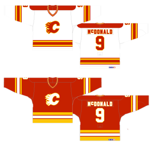
I consider these jerseys to be neck and neck in this countdown with their current jerseys that I just talked about. They’re both nice versions in many ways, but with issues that keep it from being as good as it could be. In the case of this jersey, it’s the bizarro version of their current design, where the weaknesses become the strengths, and vice versa.
In terms of the piping, these jerseys are classic. Simple, strong and well-constructed, especially on the white jerseys. On the red jerseys, the piping at the bottom is a little bit too thick, but nothing that minor changes wouldn’t fix. I like the lack of a shoulder patch on the red jerseys, and the white jerseys would be better if they removed the big red blotch on their shoulders. Those are small complaints however.
The reason the Flames brought this iteration back recently as a third jersey is because they’re simple, they’re stylish and they’re bold and aggressive jerseys, fitting for a game of hockey. The flip side is that the red jerseys have a distinct lack of contrast. The current Flames’ jerseys have the black logo and introduce black into the piping. This red jersey has neither and it’s to the detriment of the logo, which neither has the same amount of pop and aggressiveness as the white jerseys, and – mixed with a yellow outline – ends up blurring rather than defining the details of the logo.
I’m not saying it’s awful, but I just like the black logo on the current jerseys better. The red is bold, it’s brash and stands out on the ice excellently, and this is the only Flames jersey that has raised the Stanley Cup, so I will completely understand if you still love it. Oh, and there’s no pit stains on these jerseys either. Gross.
Jersey Recommendation: #9 McDonald – The iconic moustache mixed with the raising of the Stanley Cup makes this selection obvious. I was going to suggest the person who scored the Cup-winning goal, but that was Doug Gilmour, and that just might bring up bitter memories of a certain trade with the Leafs.
2. 2011 Heritage Classic Jersey
Some may think that these jerseys were too much, but for a game like the Heritage Classic, they were completely spot on. I remember watching the game on TV and thinking that the Flames actually looked like they had pulled a Biff Tannen, stolen the DeLorean, and went back to the 1920s to play a hockey game. It was really cool to watch.
These jerseys are a tribute to the old Calgary Tigers professional hockey club from the ’20s, using identical striping patterns and similar colours, but just changing the Tiger on the front to the Flames’ logo. Yeah, it’s a little bit Ronald McDonald, but within the context of playing on a sheet of white ice (outside) they’re bold and stand out dramatically.
The boldness of this jersey is drawn from it’s simplicity. The stripes are single and solid gold bands, without the striped maypole madness of some of the other versions I’ve already talked about. There’s a little bit along the bottom, to follow the contour of the jersey, and while it’s a bit thin, it’s a solid colour again and sets it off well. Even the white logo works in this case because, being on a gold background it can be outlined in red and stands out so much better.
Seriously, this is a great jersey and if I was a Calgary fan, I’d wear it with pride.
Unfortunately, it will never be the Flames’ best jersey because it just wouldn’t work as a regular jersey. It was made for the Heritage Classic and to look old-fashioned and historical. Outside of that context, it wouldn’t work nearly as well – looking dated and not reflective of the speed of the game today.
Jersey Recommendation: #17 Bourque – He scored two goals, including the game winner, during the game. Sure, he’s terrible and no longer with the team, but these jerseys haven’t been worn again since then either.
1. 2000-03 Home Jerseys, 2003-07 Home and Away Jerseys
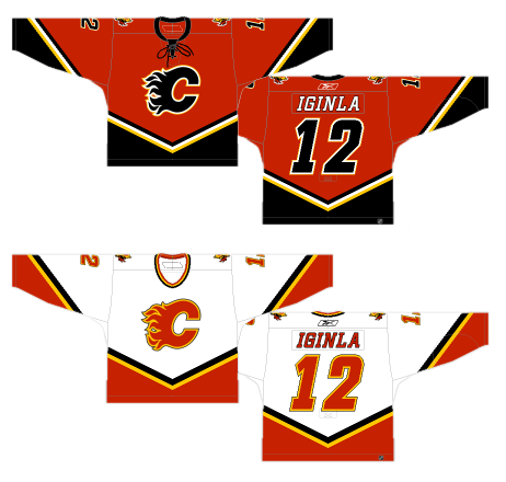
These jerseys combine a lot of the good things happening in all of the other versions. While they’re not necessarily perfect, they’re the best Flames’ players have ever worn.
First of all, it uses the black C on the red jerseys as opposed to the white one which, as I’ve stated before, makes the logo stand out a lot more and gives the jersey a more aggressive tone to it. Second, the red jersey brings the laces to the collar. Awesome! Third, it’s much cleaner and, aside from the 1980–94 jerseys, the most minimal jersey they’ve had. It works it a lot of ways. The piping is a little unorthodox, but it’s minimal enough to not be overdone like some of the other Flames’ jerseys. It’s the same as the piping from the third jerseys (with the flaming horse head), but it works a lot better on the red jerseys than the black ones, using black as an accent rather than the main colour. And like the black logo, it makes everything stand out a little better.
It works really well on the white jerseys as well. The piping on the red jersey probably doesn’t need the extra thin white stripe, but that’s a small complaint at this point. There’s still the italic font that I’m not crazy about and they kept the flaming horse heads as patches on the shoulders. So, while it’s not perfect, it’s a great jersey and should be worn with the pride that comes with knowing that the Flames have won one more Stanley Cup than my beloved Canucks.
Jersey Recommendation: #12 Iginla – The best player to ever wear a Flames jersey, on the best Flames jersey. Seems like the easiest recommendation I could make.
Recent articles from Kent Wilson