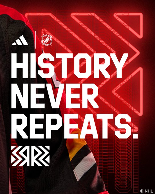
Straight 🔥 Introducing our @adidas Reverse Retro 2022 🔥 #ReverseRetro Available 11.15 #Flames | @adidashockey

Nation Sites
The Nation Network
FlamesNation has no direct affiliation to the Calgary Flames, Calgary Sports and Entertainment, NHL, or NHLPA
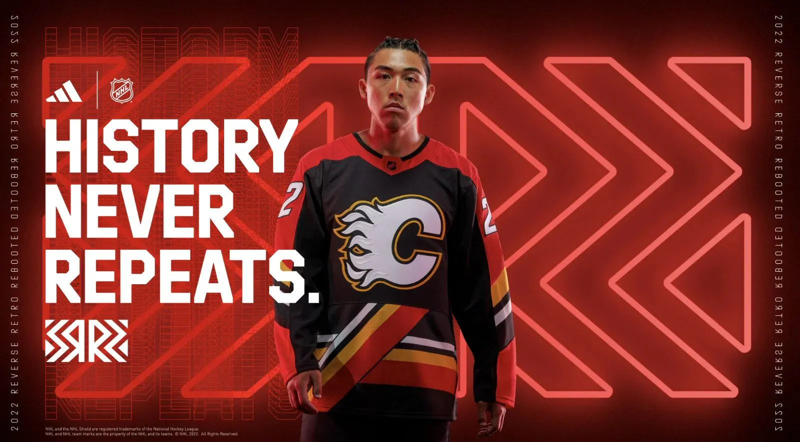
Flames hit it out of the park with fun (and weird) Reverse Retro uniform

By Mike Gould
Oct 21, 2022, 12:00 EDTUpdated: Oct 21, 2022, 12:43 EDT
Remember that 6–3 loss to the Buffalo Sabres last night? (Sorry for bringing it up).
Well, you can forget all about it now — thank goodness — because it’s time to talk about everybody’s favourite topic: Calgary Flames jerseys.
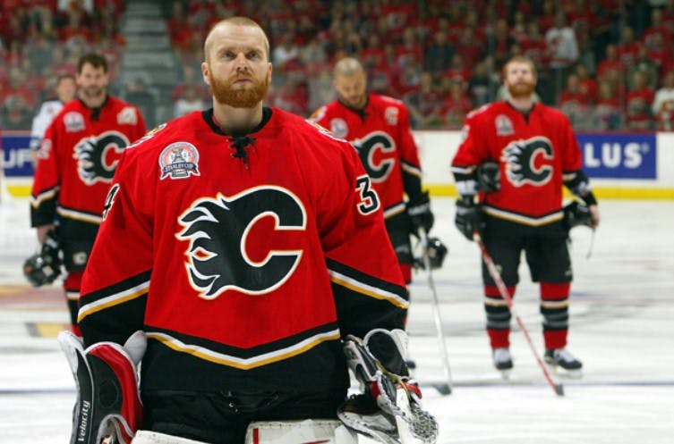
The local pro hockey club has skated in uniforms of red, yellow, and white for more than 40 years now. Black joined the rotation in 1994, first as a tertiary accent shade before becoming more prominent near the end of the decade.
Save for a few years in the early 2000s — hopefully, you also managed to forget about those — the Flames have always worn red and white primary uniforms. For good reason, too. The Flames’ current home and road uniforms are among the very best in the National Hockey League.
But in the 2022–23 season, two of the Flames’ four uniforms will be black.
Beyond the classic red and white primary uniforms, the Flames will wear their fan favourite “Blasty” alternate 12 times. On top of that, they’ll don their newly-unveiled “Reverse Retro” look on four occasions.
The Pedestal has returned.
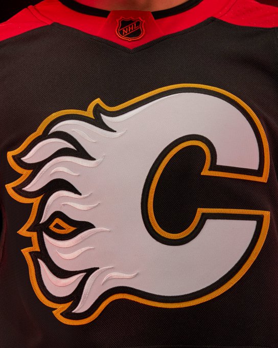
Originally worn in red and white iterations between 1994–95 and 1999–00, the uniquely busy jersey now exists with a black base. It may look a little like a Team Germany uniform, but it’ll be worn by the likes of Jonathan Huberdeau, Nazem Kadri, and Chris Tanev four times this December.
Famed Canadian artist Bill Brownridge created the Pedestal design back in the mid-’90s as part of a directive from the Flames to add black to their overall look. This time, black is the focus of the jersey. It’ll be the first time the Flames wear the iconic Flaming “C” on the chest of a black uniform.
That crest is taken directly off the shoulders of the Blasty alternate uniform. We can also confirm that the Flames will be wearing the rest of the gear from the Blasty look — pants, helmets, gloves, socks, etc. — with their new Reverse Retro. One change, however — the alternate captain insignia on the RR will be a standard letter “A,” not the Atlanta Flames logo.
All 32 NHL teams unveiled new Reverse Retro looks on Thursday. We’re not going to rank them all (our friends over at Daily Faceoff already did that) but we will take a look at a few of them.
But first … here’s an assessment of the Flames’ new threads.
Evaluating the Flames’ RR
After bringing back the Blasty look for their first Reverse Retro back in the 2020–21 season, the Flames’ obvious next option was the Pedestal. And boy, did they ever go for it.
The Flames didn’t play it safe with this new jersey. They took a swing. For my money, it paid off. These things are going to look great on the ice. The Flames weren’t any good when they wore the Pedestals in the ’90s, but these were still the first uniforms Jarome Iginla wore as an NHL player. That counts for something.
Back in black 🔥 #ReverseRetro Get yours 11.15 #Flames | @adidashockey

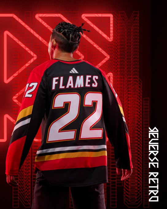
The one thing that bugs me a little about this new RR look is the seam separating the sublimated Pedestal striping at the waist from the rest of the uniform. That was never there on the ’90s-era CCM and Starter Pedestal uniforms, but we’ve heard Adidas had trouble manufacturing the jersey any other way. It certainly isn’t a huge deal.
The letters and numbers look great and I’m a sucker for striping running down the arms from the shoulders. I certainly wouldn’t want these to stick around as more than a one-off, but it’s almost perfect as a Reverse Retro look. I’m giving it a solid A grade.
Here’s how a few of our FN contributors graded the Flames’ new RR:
Mike: A
Shane: B+
Ryan: B
Paige: B
Shane: B+
Ryan: B
Paige: B
Ranking the Canadian RR jerseys
We aren’t in a position to do a full ranking, but this should be enough to get some debate flowing in the comments section.
Seven Canadian teams. Seven Reverse Retro jerseys. Speaking purely for myself, here’s a very subjective ranking of the Canadian NHL teams’ Reverse Retro looks (from worst to best).

7. Edmonton Oilers
These might have looked better with copper replacing the orange. Nevertheless, the Oilers’ old Todd McFarlane-designed uniform was never a work of art in the first place. With the silver stripes on the arms and waist now replaced by orange, the jersey loses a lot of the balance it once had. It manages to be both dull and tacky. Bad combo.

6. Toronto Maple Leafs
It’s definitely a Leafs jersey. The white shoulders are neat and the felt logo probably looks fantastic in person. That said, these give off strong “50% off at Lids” vibes. Hey, at least they’re not covered in grey for no reason.

5. Vancouver Canucks
The striping on these is obnoxious and I’m not sure how I feel about the chest numbers. But that shade of blue contrasts so nicely against the bright green. The logo is fine but it’d probably resonate better if the Canucks’ AHL affiliate wasn’t already using something pretty much identical. Like, it’d be weird if the Flames suddenly skated out wearing Wranglers jerseys.

4. Ottawa Senators
We’re not sure why the Senators elected to remove the “Senagoth” logo from the front of these, and the swoosh element would probably look better filled in with a different colour than black. It certainly isn’t a bad look, though. The 2D Centurion crest still goes hard and the old-school numbers are sweet. But it feels like the Sens could’ve done more.

3. Montreal Canadiens
So much for le Tricolore, right? Worth it, though. The baby blue looks fantastic. It’s an obvious homage to the Expos and it works so well. Sean Monahan is gonna look great in one of these.

2. Calgary Flames
They’re both fun and polarizing. Isn’t that what the Reverse Retro program is for? Good luck finding someone whose reaction to the Flames’ new uniforms is “meh.” Love ’em or hate ’em, you can’t deny that the Flames met the brief (and then some) with these. But it’s hard to tell whether they’ll sell like hotcakes like the last Reverse Retro or linger on FanAttic clearance racks until Elias Lindholm hits unrestricted free agency.

1. Winnipeg Jets
It’s whiteout time! The Jets completely nailed it by finally bringing back their classic 1990s look with updated colours, giving their fans something new to wear to playoff games at Canada Life Centre (whenever that happens again). Those two shades of blue look fantastic together. Good on the Jets for not going overboard — keeping it simple was the right call.
Best and worst around the NHL

Best: Florida Panthers
These are so cool. The base colour is unique enough to begin with, but I’m not sure if we’ve ever seen a sky blue uniform with such strong accent colours. The red and yellow pop so nicely against that backdrop. Somehow, it all just works. The Panthers are a solid 2-for-2 with the Reverse Retro program.

Worst: Detroit Red Wings
Gross. What in the world is going on here? This is a Chicago Blackhawks jersey with “DETROIT” slapped on the chest. It seriously looks almost identical to Chicago’s new Reverse Retro (which also isn’t great). What’s the deal with all the black? Why does it look like the answer to “What’s black and white and red all over?”
Wrapping it up
The Flames will wear their classic red uniforms just 25 times at home this year. Collectively, the two black uniforms will take up the other 16 dates at the Scotiabank Saddledome during the regular season.
From this vantage point, that doesn’t feel like enough red. Quite frankly, 12 dates for the Blasty uniform is a little excessive. It’s a cool novelty, but there’s no reason to wear it more than 6–8 times a year.
What we’d love to see at some point is the return of the 2004-style “Black C” uniform as the Flames’ fourth jersey. We’re talking a direct throwback — no Reverse Retro-ification, no flags, no piping, and certainly not whatever this prototype was.
The Flames’ 2004 jerseys: gone too soon.
Bring back the red 2004 jersey exactly as it was, within the limitations of current manufacturing standards. We know Adidas can handle chevron striping, Blasty on the shoulders, and the italic font on the back.
Keep Blasty, by all means, and wear it between a half-dozen and eight times a year. But we’d also love to see a second red uniform, and the 2004 look was arguably the most striking design the Flames have ever worn. It’s a shame it was only worn for three seasons and it needs to be revived, dangit!
Here’s a potential blueprint:
Retro red: Primary home
Retro white: Primary road
Alternate (Blasty): 6–8 games per season
Throwback (2004 red): 2–4 games per season — and always against Tampa Bay
Retro white: Primary road
Alternate (Blasty): 6–8 games per season
Throwback (2004 red): 2–4 games per season — and always against Tampa Bay
OK, that’s enough about jerseys (for now). For those of you in the comments section, fear not — we’ll have some Calgary Wranglers coverage coming atcha later today.
Until then … do you plan to get one of the Flames’ new Reverse Retro uniforms? Do you hate them with the burning passion of a million red giant stars? Do you think the Flames should stick to just two jerseys or always go with four (or even more)? Let us know!
Breaking News
- Flames Prospect Roundup: How the standings shape up entering the holiday break
- NHL Notebook: Sidney Crosby takes sole possession of most points in Penguins’ franchise history
- FlamesNation Mailbag: Waiting for Santa with reader questions
- Flames injury news: positive signs for Martin Pospisil
- Recap: Martin Frk leads Wranglers to memorable Winter Wranglerfest win in more ways than one